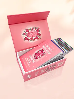
 Custom Card Decks
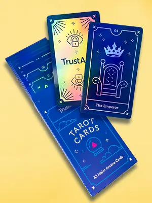 Custom Holographic Cards
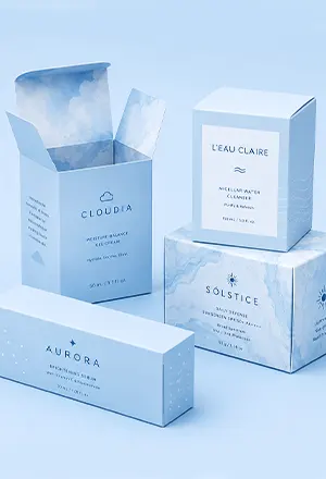 Folding Cartons
 Rigid Boxes
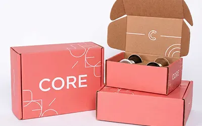 Corrugated Boxes
 Custom Board Game
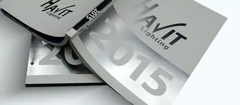
 Kickstarter Print Solutions
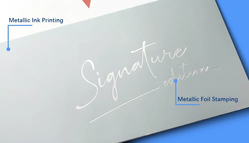
Metallic Ink Printing
What Is Metallic Ink Printing?
Metallic ink printing uses Pantone metallic spot inks — inks loaded with fine aluminum or bronze particles — to create a reflective, shimmering finish on printed materials. The metallic particles align on the paper surface during drying and reflect light in a way that standard CMYK inks cannot produce.
Metallic inks print as spot colors using a dedicated press unit, separate from your CMYK layers. They can run in the same press pass as CMYK, making them a practical and cost-effective way to add a metallic element to any printed piece without a separate finishing operation — a faster and more cost-effective route than foil stamping, particularly for quantities above 3,000 pieces where metallic ink printing becomes significantly more economical per unit..
The result is a warm, lustrous sheen — clearly metallic, visually striking, and available in hundreds of Pantone colors ranging from classic gold and silver to rose gold, copper, bronze, and a wide range of tinted metallics.
When to Choose Metallic Ink
Metallic ink is the right choice for the following situations:
- Large metallic coverage areas. If you need a metallic background, a full-bleed metallic field, or a repeating metallic pattern across a large area, metallic ink is significantly more cost-effective than foil stamping, where cost scales directly with the area covered by foil.
- Designs with fine detail, small text, or gradients. Metallic ink prints through a standard offset plate and can reproduce fine lines, small type, halftone screens, and tonal fades cleanly. Foil stamping cannot reproduce gradients or fine halftone detail at all.
- Metallic elements integrated with full-color CMYK printing. Because metallic ink runs in the same press pass as CMYK, it integrates seamlessly with full-color artwork. There’s no separate finishing step, no registration issue between print and foil, and no additional production time.
- Designs requiring tinted or blended metallic colors. Metallic inks can be printed in halftone to create lighter, subtler metallic areas, or combined with CMYK inks to produce tinted metallic hues (e.g., a warm rose-tinted gold or a cool blue-silver). Foil is available only in pre-manufactured solid colors; custom tints and gradient blends within a foil element are not possible.
- Projects where the metallic element needs to cover the whole surface evenly. Metallic ink covers large flat areas consistently and economically. Foil stamping on very large coverage areas is technically possible but expensive and more prone to surface variation.
When foil stamping is the better choice: If your metallic element is a logo, title, icon, or other focal-point graphic where maximum visual impact matters — or if your design requires screened or halftone metallic on dark or colored stock (solid metallic ink covers dark stock well, but halftone metallic on dark stock looks poor because the substrate shows through the dot gaps, and standard offset printing cannot add a white underprint) — foil stamping will produce a stronger result.
Metallic Ink vs. Foil Stamping
Both techniques add a metallic element to a printed piece, but they work differently and produce different results.
| Metallic Ink | Foil Stamping | |
|---|---|---|
| Finish | Warm, lustrous sheen — clearly metallic but softer | Mirror-like, intensely reflective — true metallic shine |
| Fine detail | Excellent — handles fine lines, small text, halftones | Limited — minimum 1pt stroke, 6pt+ text recommended |
| Gradients | Yes | No |
| Large coverage areas | Cost-effective at any size | Cost increases with coverage area |
| Dark stock | Solid coverage works well on dark stock. Halftone/screened areas look poor — dark paper shows through the dots. | Yes |
| Die/setup cost | CTP plate and metallic spot ink required. No custom die. Setup cost is equivalent to any other Pantone spot color. | Custom die required per design (one-time cost) |
| Combine with CMYK | Yes | Yes |
| Combine with embossing | Yes | Yes |
| Combine with spot UV | Yes | Yes |
| Best for | Large metallic areas, detailed designs, gradients, full-bleed metallic fields | Logos, titles, focal-point icons; maximum visual impact; dark stock |
For a complete guide to choosing between the two techniques, see our article: Foil Stamping vs. Metallic Ink: What’s the Difference and Which Should You Choose?
Metallic Ink vs. Standard CMYK
| Metallic Ink | Standard CMYK | |
|---|---|---|
| Visual effect | Reflective, shimmering metallic sheen | Non-metallic; built from transparent ink dots |
| Color build | Pre-mixed Pantone spot color, printed as a single ink layer | Four transparent ink layers (cyan, magenta, yellow, black) combined in halftone |
| Opacity | At 100% solid, metallic ink covers the substrate effectively. At halftone coverage, the substrate shows through the dot gaps. | Transparent; substrate color affects result |
| Press unit | Dedicated spot color unit | Four standard CMYK units |
| Halftones / gradients | Yes — metallic ink can be screened to create lighter metallic areas and tonal fades | Yes — the core mechanism of CMYK printing |
| Works on dark paper | Solid metallic ink covers dark and colored stock well. Halftone-screened metallic on dark stock looks poor — the dark substrate shows through the dot gaps. | No — transparent inks require a white or light substrate |
Metallic Color Options & Swatches
We support the Pantone® Metallics systems. Popular choices include:
- Pantone 871 C–877 C (classic golds & silvers)
- Pantone 8001 C–8985 C (expanded metallic range)


Notes:
- Final appearance depends on the paper/board and any coatings—always evaluate on your target stock.
- We can mix custom metallic tints or print CMYK over metallic silver to create tinted metallic hues.
- A printed drawdown on your chosen stock is the most reliable swatch.
- Digital proofs cannot reproduce metallic inks. For critical metallic applications, we can run a short press test or provide recent metallic drawdowns on similar stocks.
Paper and Material Compatibility
Metallic ink prints on all standard offset substrates. Here’s how different paper types affect the result:
| Paper/Substrate | Metallic Ink | Notes |
|---|---|---|
| Coated paper (gloss or silk) | Excellent | Best results; smooth surface maximizes particle alignment and sheen |
| Coated paper with gloss lamination | Excellent | Gloss lamination enhances apparent shine; applied after ink is fully cured |
| Coated paper with matte or soft-touch lamination | Good | Slightly mutes the metallic sheen; gives a premium, refined feel |
| Uncoated paper | Okay | Ink absorbs slightly more into the fiber; sheen is subtler, slight metallic |
| Dark or colored stock | Solid: Good. Halftone/screened: Poor. | Solid (100%) metallic ink covers dark and colored stock well — the metallic particles are dense enough to obscure the substrate. Halftone-screened metallic ink on dark stock looks poor: the dark paper shows through the dot gaps, killing the metallic effect. |
| Recycled or textured stock | Good | Works well on most recycled stocks; heavy textures may reduce sheen consistency |
| Cloth or faux leather | No | Metallic ink cannot print on cloth or faux leather — use foil stamping instead |
Compatible Finishes
Metallic ink pairs well with the following finishing techniques:
Lamination
Lamination is applied over printed and cured metallic ink. The effect on the metallic sheen depends on the lamination type:
- Gloss lamination: Amplifies the metallic effect, producing the most vibrant result.
- Matte or soft-touch lamination: Slightly subdues the sheen, creating a more refined, premium feel. Popular for luxury packaging and high-end book covers.
Important: always apply lamination only after metallic inks are fully cured to prevent rub-off or adhesion issues.
Spot UV
Metallic ink and spot UV can be combined on the same piece. A common application is a metallic ink field with spot UV applied selectively on top — the gloss UV on matte metallic ink creates strong visual contrast. Confirm the production sequence with your printer before finalizing artwork.
Embossing and Debossing
Metallic ink and embossing or debossing can appear on the same printed piece. However, they cannot be applied to the exact same area in a single step: the die pressure required for embossing would damage the cured ink surface, and the results would be inconsistent. If you want both metallic color and a raised or recessed texture in the same element, foil stamping with embossing (foil embossing) is the appropriate technique.
File Setup and Prepress Guidelines
Setting up metallic ink as a Pantone spot color
- In Illustrator or InDesign, create a new swatch and set the type to Spot Color.
- Name the swatch exactly as the Pantone reference, including the suffix (e.g., “PANTONE 871 C”). Naming errors at preflight are a common cause of production delays.
- Fill all metallic artwork areas with this swatch. Do not use approximate CMYK or RGB values — they will not print as metallic.
- Keep metallic layers separate and clearly labeled (e.g., Metallic_Gold_P871C) to prevent preflight ambiguity.
Artwork and file format
- Use vector paths for all linework and text within metallic areas wherever possible. Raster elements should be at least 300 dpi at final print size.
- Export as PDF with spot color preservation enabled.
Opacity and overprint
- Metallic inks are semi-opaque. If metallic ink is stacked over CMYK, the metallic will visually dominate and may obscure fine CMYK detail underneath. Plan overlaps intentionally.
- For large metallic solids, specify a protective coating to minimize scuffing during handling and shipment.
Halftones and gradients
- Metallic ink can be screened in halftone to create lighter metallic tones and gradients. Sheen is strongest in solid areas; halftone areas appear subtler.
- CMYK inks can be printed over a metallic silver base to create tinted metallic effects (e.g., printing a light cyan over Pantone 877 C produces a cool blue-silver tone).
Applications
Book covers and slipcases
Metallic ink is widely used for title lettering, author names, background patterns, and border elements on book covers. It prints cleanly in the same pass as the full-color cover artwork, making it a practical upgrade for any book where a premium feel matters.
Packaging
Premium folding cartons, rigid boxes, and sleeves frequently use metallic ink for borders, pattern fills, and brand marks. Metallic ink’s ability to cover large areas economically makes it well suited for packaging designs where metallic color spans a significant portion of the surface.
Card decks, stationery, and invitations
Metallic ink adds elegance to playing cards, tarot decks, and stationery. Its compatibility with halftone screening allows for subtle gradient metallic effects that foil stamping cannot replicate, which works particularly well on decorative borders and watermark-style background patterns.
Catalogs and magazines
Metallic ink can be used for spot accents — rules, callout boxes, headings, and image frames — throughout a catalog or magazine, adding a consistent premium feel at a cost that scales well across longer page counts.
Frequently Asked Questions
How shiny is metallic ink compared to foil stamping?
Metallic ink produces a warm, lustrous sheen that is clearly metallic but noticeably softer than foil stamping. Foil stamping produces a true mirror-like, intensely reflective finish because it is an actual metallic film bonded to the surface, not a pigment. If you pick up a premium hardcover book and see a brilliant gold title that seems to glow, it’s almost certainly foil stamping. The more diffuse, warm shimmer you see on background patterns or large metallic areas is typically metallic ink.
Can metallic ink print on dark paper?
Yes. At 100% solid coverage, metallic ink contains enough metallic particles to cover dark and colored paper effectively — the result is a clean, fully metallic surface with no substrate color showing through. However, if the metallic ink is screened in halftone (to create gradients, lighter tones, or tinted metallic effects), the dark paper shows through the gaps between ink dots, which degrades the metallic appearance significantly. On dark stock, use metallic ink only as a solid; avoid halftone or gradient metallic areas. If your design requires screened metallic on dark stock, foil stamping is the more reliable choice because it is fully opaque regardless of coverage area or the substrate beneath it. Note also that standard offset printing cannot print white ink — a white underprint to boost opacity is not an option in a standard offset run.
Will lamination affect the metallic effect?
Yes. Gloss lamination applied over metallic ink enhances the apparent shine and produces the most vibrant result. Matte or soft-touch lamination slightly subdues the sheen but adds a premium tactile quality that works very well for luxury packaging and book covers. Aqueous coating protects against rub-off with minimal change to the optical effect.
Can I use halftones with metallic ink?
Yes. Metallic ink can be screened in halftone patterns to create tonal fades, gradients, and lighter metallic areas. The metallic sheen is strongest in solid areas; halftone-screened areas appear subtler but remain clearly metallic. This tonal flexibility is one of the key advantages of metallic ink over foil stamping, which is a solid-fill-only process.
Can I get an accurate proof that shows the metallic effect?
Digital proofs simulate CMYK colors only and cannot reproduce metallic ink. For accurate evaluation of a specific metallic Pantone color on your chosen stock, we can run a short offset press test or provide recent drawdowns we’ve printed on similar stocks. Press tests involve plate and ink setup, so they carry a cost above standard digital proofing. We recommend this step for any project where the metallic result is critical to the design brief.
Have a project in mind? Let's talk.
Tell us about your project — the product, the design, the metallic colors you have in mind, and your quantity — and we’ll give you a clear recommendation.
Related Resources