Pantone Color Printing
We explain everything you need to know about the Pantone color system and when it might be the best option to choose for your custom box design
While computer screens display objects using the simplified RGB color space by default, when you design for print, you must use either the CMYK color space or the Pantone color system so that your print color reproduction is accurate and clear. For most purposes, the CMYK color space is fine. But if you have specific or unusual color needs — such as for a unique color-branded logo or for speciality packaging solutions — then you may want to work with the Pantone system.
What Is the Pantone Color System?
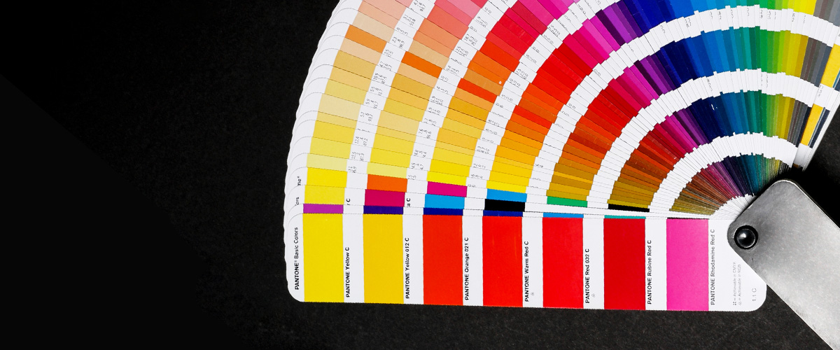
The Pantone color system is a standardized color reproduction system which was invented back in the 1950s by an advertising agent named Lawrence Herbet; and then formalized for commercial use almost a decade later, in the 1960s. It’s been used ever since across several industries that rely on accurate color-matching, such as graphic design, the fashion and cosmetics industries, and, of course, high-end printing.
The big deal about the Pantone system is that it enables businesses to generate exact color matches — and even create unique branded colors — which will replicate precisely regardless of the printing methods used to reproduce them. In the Pantone system, each color has its own numerical code, known as a “PMS” number — for Pantone Matching System. The system makes it possible to guarantee perfect color fidelity across all publicity, marketing, and packaging. The only caveat is that — as with any color printing — there will always be slight variance based on the material substrate and surface coatings on which you’re printing.
When to Choose Pantone
While CMYK color printing is the most commonly used, including for custom packaging solutions, several companies also choose Pantone colors for boxes and other packaging. Typically, they’ll use it for the logo if it was originally designed in Pantone and has colors that can’t easily be reproduced any other way. If your project demands extreme accuracy in color reproduction, or if your brand and logo contain unique colors, then Pantone is a must.
The Pantone Color Range
The Main Colors
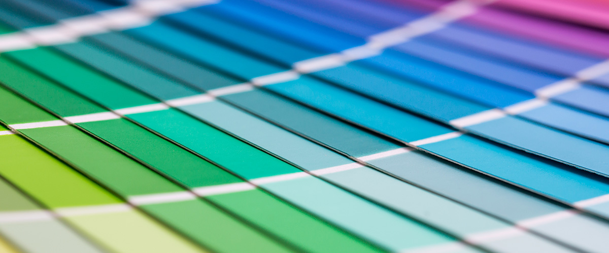
The Pantone System contains 1, 867 solid colors, each assigned a unique three-number code followed by either “C” or “U” to indicate coated or uncoated paper.
Metallic Colors
In addition to the main colors, a range of metallic shades are also available. You can recognize a metallic code — which may have three or four numbers — as it begins with an 8 and always ends with a “C” as there are no uncoated paper versions. There’s also a range of premium metallics indicated by a five-number code. Pantone metallics are a popular choice in custom box design.
Pastel and Neon Colors
Pastel shades and neon tones have three or four number codes starting with “9” and are available in both coated and uncoated versions.
White Ink
If your choice of packaging paper is brown kraft or dark colored paper, we can also use white ink. And if you want to print images on the surface of any colored paper, we need to print the design or text in white ink first, and then apply the images over the top.
The Pros and Cons of the Pantone Color System
While, as we said at the outset, CMYK color printing is good in most cases, one advantage of using the Pantone color matching system is that the colors are always perfectly mixed. So, you know that your logo, say, or branded colors will be consistent from one print job to the next.
Pantone color printing is also called “spot color printing”. The CMYK printing process creates the color by building up layers with different colored “dots”. Pantone—spot color printing– uses ready-mixed ink to print the true colors directly to the substrate. So, Pantone color printing gives a more “solid” look than CMYK printing.
Setting up your design to use a “spot color” in the Pantone range can be an effective and economical way to enhance your branding without the added expense of a full pantone print job. With a spot color, the ink is applied just to a specific area, to highlight it and make it stand out from the background colors or artwork.
Because Pantone color printing uses ready-mixed ink, it affords highly consistent color reproduction throughout the process and on all surfaces. For packaging products, keeping the same color can be vitally important for both quality and branding consistency. So, the main colors in your packaging should ideally be printed with Pantone colors.
On the downside, a full pantone print on your custom packaging will be more costly than creating it using the CMYK color system. It will also take longer to produce. In many cases, we can get very close to most Pantone colors using the CMYK system, so if you have a tight budget, that would be better for you.
Undecided Between CMYK and Pantone?
It’s not always easy to weigh up these pros and cons to come to decision for your product. With Pantone, you’re guaranteed perfect color matching, but you’ll pay a premium for that level of accuracy, and it will take longer to turn the job around. With CMYK, you can’t 100% guarantee the faithfulness of the color reproduction to your original design — although for most purposes it will be close enough to make little difference — but it costs less and we can offer a faster turnaround. if you have any doubts, get in touch. One of our experts will be happy to talk through your needs and recommend the best option for you based on your project and your budget.
How to Prepare Artwork Using the Pantone Color System
But if you are going to use Pantone in your design, make sure to follow these simple steps to make generating your files as straightforward as possible. In this example, we’ll refer to Adobe Illustrator as it’s the best software available for this kind of work, in our opinion. But the fundamentals are similar in alternative applications, so it should still be helpful.
Creating a Pantone Color Design in Adobe Illustrator
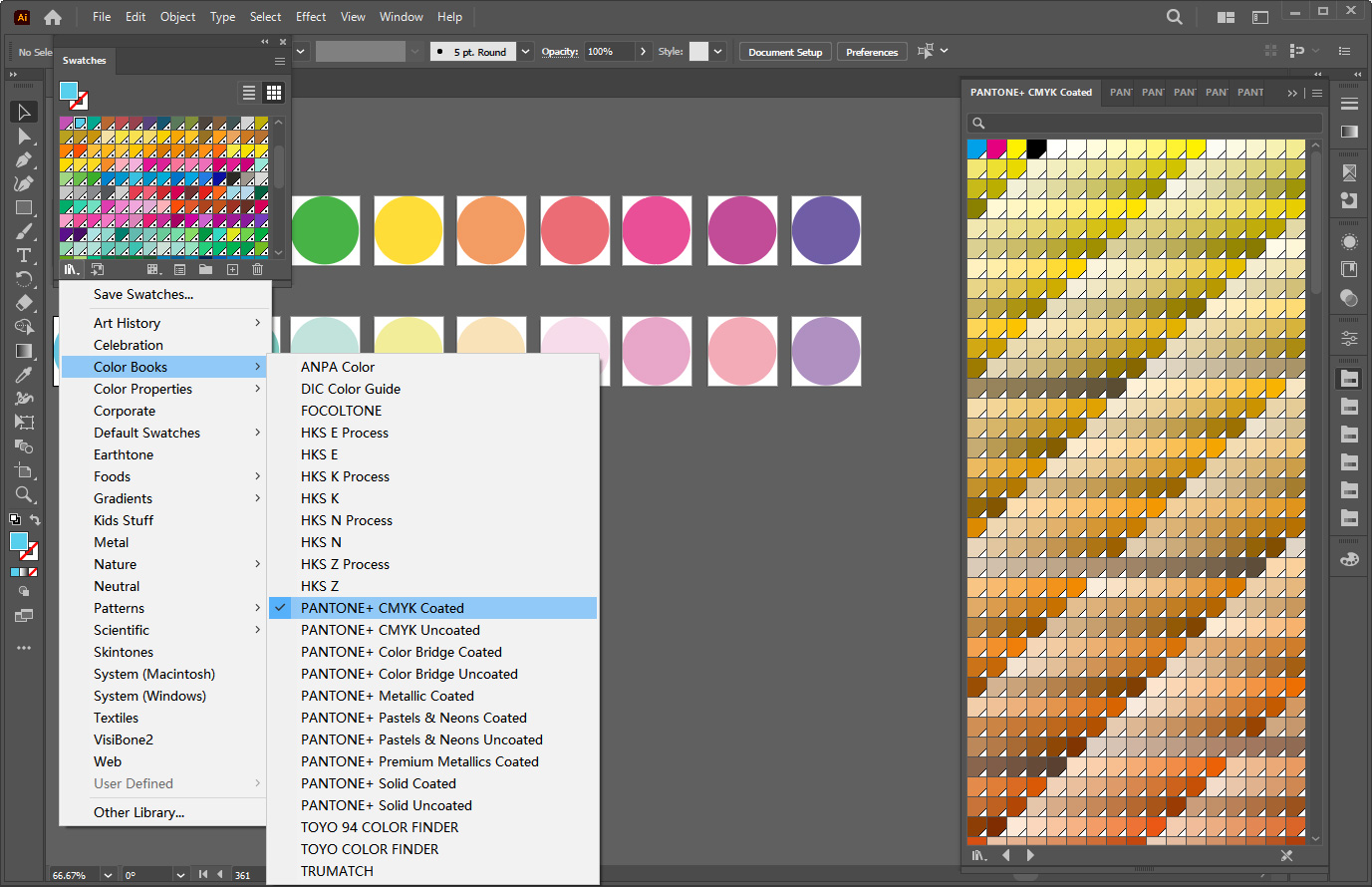
The first step is to open the Swatches palette as you will need it to generate Pantone colors in your artwork. Go to >Window< then >Swatches< then click on the palette menu. Click >Open Swatch Library< and >Color Books< then select the Pantone book you need; for example, Solid Coated or Solid Uncoated.
Now you should see the Pantone color book you’ve chosen. From here you can create your color palette. You may already know the codes for the colors you want to use, in which case just enter them in search and click them into the palette until you have transferred them all. If you don’t have codes, browse the available colors, click on any swatch you want to include, and it will transfer to the palette.
Once you’ve generated your palette, you can apply the color choices to your vector graphics. For this, you’ll need to use the Selection Tool. Position it over the vector to which you want to apply the color, and then click the appropriate swatch from the palette. Just keep going until you’ve completely colored your work.
Once you’re done, you can export your files as high-quality PDFs. If you’ve been using one of our templates or a custom template we’ve made for you, remember to keep it in a separate layer and to leave that layer at the top.
Need More Help? Let's Talk!
If you’re ready to start on your custom box artwork design using the Pantone system and there’s something you’re still not sure about, we should talk. With 25 years of success in the business and counting, we’re confident that with our expertise, knowledge, state-of-the-art technology, and commitment to personalized customer care, we can help you get your design just right. Get in touch to discuss your needs or ask us questions. Our experts will be delighted to help.
 Custom Card Decks
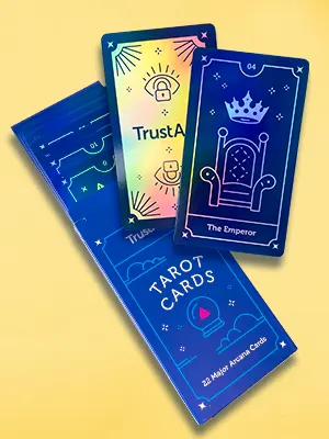 Custom Holographic Cards
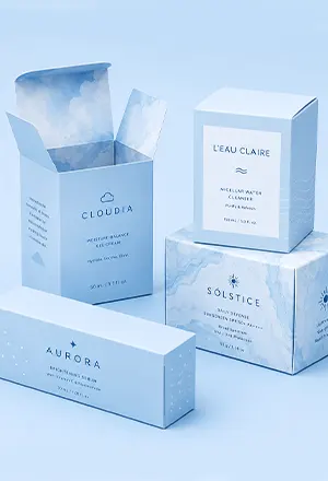 Folding Cartons
 Rigid Boxes
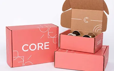 Corrugated Boxes
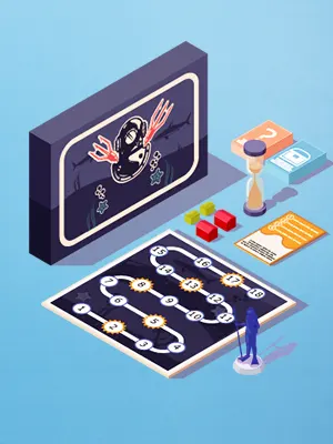 Custom Board Game
 Kickstarter Print Solutions