We give you the facts on the costs of creating, printing, and self-publishing your own comic books
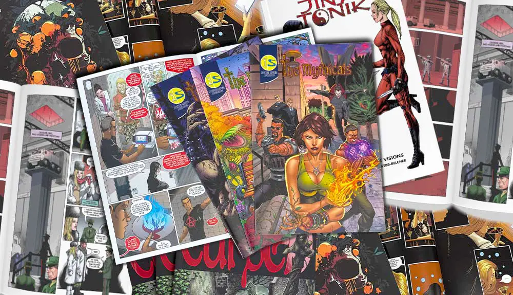
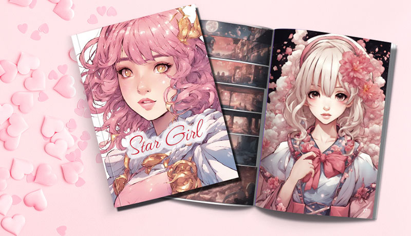
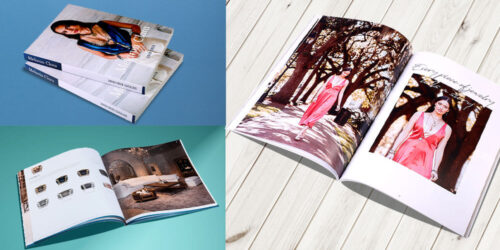
Comic book printed by QinPrinting
If you’re a fan of comic books with a talent for storytelling and a bit of artistic flair, sooner or later you’ll have dreamed about creating your own comic. And why not? These days, with the amazing digital resources available and the possibilities for worldwide distribution open to independent creatives, there’s no reason you shouldn’t design, create, print, and sell your own comic books.
If you’re anything like the other comic book creators we work with, it’s unlikely that you’re short of ideas for characters, stories, and artwork. Those aspects probably come naturally to you, and if to that natural talent and creativity you can add a little self-discipline and a bit of business sense, you could have a profitable hobby or even a full-time income from writing and publishing comic books. We know — because we print a lot of comics for independent publishers just like you — that the Internet has made successful DIY comic book creation a realistic, achievable goal for many more writers and artists than ever before.
At-a-Glance Summary:
- Initial Costs:
- Traditional supplies: $150-$300 (drawing board, pencils, pens, inks, paper, accessories)
- Digital supplies: $300-$500 minimum (computer/tablet, graphic software), up to $10,000 for professional setups
- Scanning Artwork:
- Professional scanning: $60-$250 per page
- Quality scanner investment: $3000-$5000
- Printing Costs:
- Factors: size, color vs. black-and-white, paper quality, binding method
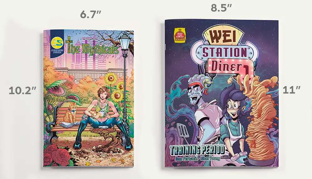
- Standard comic size: 6.7″ x 10.2″
- Recommended: Black-and-white interiors with full-color cover for cost efficiency
- Binding options: Saddle-stitch (cheaper, shorter comics), Perfect-bound (economical, professional look), Hardcover (premium editions)
- Marketing and Self-Publishing:
- Free options (social media, events) or paid services ($50 to thousands)
- Suggested marketing budget: $500-$1,000 for first-time creators
- Total Estimated Costs:
- Startup cost (100 copies, 48-page, perfect-bound, color): $1,000-$5,000
You can create a comic book at no cost — you can write the story and create the artwork either by hand with paper and ink, or in a digital design program. But if you want to sell your work, then you’ll need to up your game a little, go deeper into design, and work with an experienced offset printer (that’s us, by the way!). Still, in this post we’re going to focus on one practical aspect of setting up as a comic book creator: the expenses, the budget, how many of your hard-earned dollars you’ll need to invest. So, how much does it cost to print a comic book and self-publish it?
When you’re creating and publishing comic books, you go through several stages, each with its costs attached. So, in the next sections, we’ll go through each of these aspects one by one. We won’t be able to give you precise figures in every case, because much will depend on the details of your project. But we can give you a ballpark notion of the expenses involved. Where we can, we’ll give you hints about how to cut costs without cutting corners; and you’ll find our “at-a-glance” price charts useful, along with our online print cost calculator for a more detailed and project-specific price quotation.
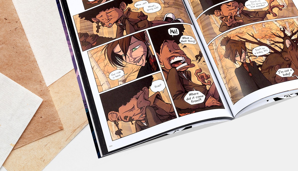
Comic book printed by QinPrinting
Comic book creation start-up costs
You have three ways to create your draft comic: traditionally, digitally, or using a hybrid method. Each has its advantages and disadvantages. Several comic book creators use only one method, others switch between them for different projects, and others do the preparatory work in traditional materials and then finish everything digitally.
Traditional comic book art supplies costs
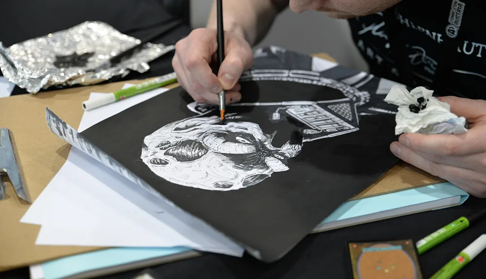
The fundamental art consumables needed to make a comic book are reasonably priced and readily available. Others are more expensive and you’ll need to go to a specialist supplier to get them. Then there’s the “hardware” which can represent a significant outlay, but you’ll only need to buy it once. Prices go up and down, so it’s always worth doing your research when you’re ready to make a start. Here’s a list of essentials to get you started, with an average cost for each at the time of writing:
- A professional drawing board or drafting table: you can choose a desktop drawing board or a standalone unit. The simplest drawing boards provide only a flat surface with an adjustable angle and a tray for pencils, pens, and so on. Others have sliding rulers, protractors, inbuilt compass holes and more. You’ll pay anything from a handful of dollars for the simplest wooden drawing board to $1,000+ for the fanciest drafting table with all the gadgets of which you can dream. If you’re serious about creating comics and want a professional solution that won’t leave you bankrupt, expect to spend between $100 to $300.
- Pencils, pens, brushes, and inks: you’ll need a good range of basic pencils and pens. Most of these, you can buy economically as purpose-made sets developed to answer the needs of cartoonists, comic book artists, and graphic designers. To get started, expect to spend between $20 to $150 for a set of hard and soft graphite pencils; about the same for colored and black sets of micro-line pens; and another $30 to $100 on a serviceable set of brush pens; and around the $30 mark for a set of sable or soft nylon watercolor/acrylic brushes; a set of 120 ml acrylic primary colors plus black and white has a price tag of $20 to $30 depending on the quality.
- Paper: the traditional and most popular paper among cartoonists and comic book artists is “Bristol paper”. It’s made of laminated sheets which give it an almost card-like strength and it comes in smooth and vellum finishes. If you’re drawing in black and white and using inks, the smooth version gives more fluidity and a crisper, brighter look to the work. For working in pencils, and if you want to use colored washes, the vellum finish has more grip and greater absorbency. A lot of artists like to work on “Layout bond”. It’s a translucent paper which works well with pencils — both graphite and colored — along with standard inks and brush pens. Layout bond is lightweight and you can use it like tracing paper to transfer designs from one sheet to another. A block of 20, 9″ by 12″ sheets of Bristol board or Layout bond each cost under $20. A larger size, say, 19″ by 24″ has a price tag of around $30 to $40.
- Rulers, compasses, and other accessories: you’ll need a steel ruler, compasses, triangles, protractors, shape templates, and erasers. You can buy sets of professional “drafting tools” for between $50 and $500; a good quality “geometry set” can cost as little as $10 to $25.
So, you can expect the average minimum spend to furnish a professional-level traditional comic book creation studio to be about $150 to $200 (even if you must set it up on the kitchen table and pack it away after because of space restrictions!). In principle, with a little creativity, you could spend less and “make do and improvise”. In the end, it’s the results you achieve, not the tools you use, that matter. At the other end of the scale, if you have the resources and want to buy the highest-level equipment, you could spend thousands of dollars without blinking!
Costs of scanning artwork
If you work in traditional media, you’ll need to scan your artwork, as your printer will need digital files. You can take your artwork to a studio to be scanned — with prices between $60 to $250 per page for high-quality reproduction — or you can invest in your own scanner. A scanner suitable for graphic arts reproduction costs between $3000 and $5000.
Digital comic book art supplies costs
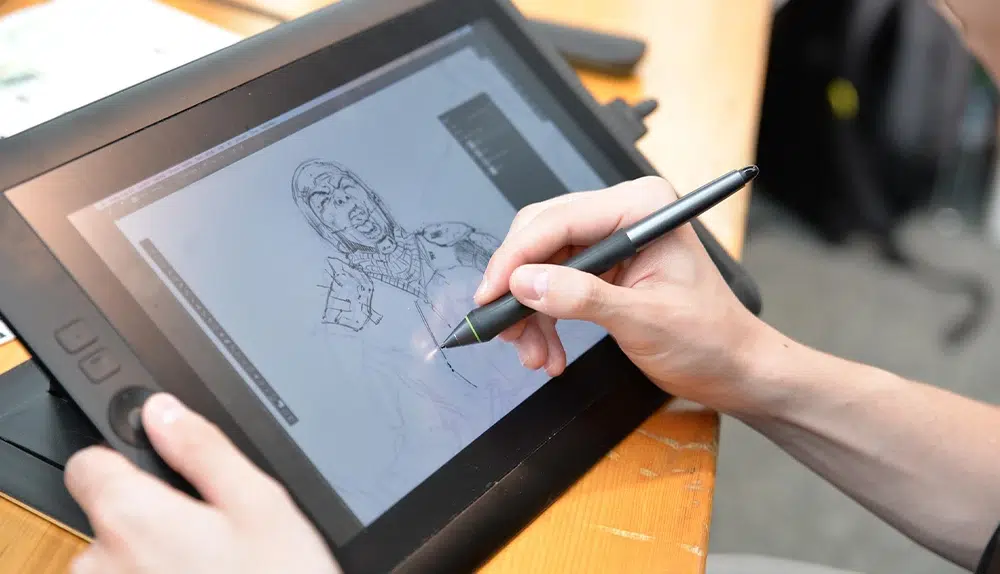
Image by tunechick83 from Pixabay
You don’t need as much “stuff” to create your comic book artwork by digital means. You just need the hardware — a computer or tablet — and good graphic design software. But the initial costs of the hardware and software if you don’t already have them can be expensive. Here is a range of popular options used by amateur and professional comic book creators.
- Desktop computers and tablets: most professional designers prefer to use Apple’s Mac computers for graphic design; but several are happy with Windows or Linux-based PC alternatives. In the end, it’s a matter of preference. If you prefer the portability of a tablet, make sure you choose a model with a large working area, high-resolution display, a pressure sensitivity of over 1,000 RPS, and a good stylus that’s comfortable in your hand. Graphics tablets come without screens and that choice is as much as personal one as anything else. An iMac desktop computer will cost you anything from $1,000 to just under $10,000. You can get a Microsoft Surface Studio PC for a little under $4,000 for the desktop version, and a laptop option with similar specifications for around $1,500. A graphics tablet will set you back between, say, $200 for an XPPen Artist 12 and $3,000 for the Wacom Mobile Studio Pro.
- Graphic design software for comic book creators: the firm favorites for almost all professional graphic designers — top comic book creators included — are Adobe’s graphic design suite, including Photoshop, Lightroom, Illustrator, InDesign, and more. You can subscribe from $20.99 per month just for Photoshop to $54.99 per month for access to everything. But you’ll find comic book artists who favor one-off payments to use Corel Painter ($98), Clip Studio ($60), and Krita ($30). If you’re just experimenting, you could also check out the best of the non-professional apps such as Comic Creator Studio, Manga Maker, and Comic Draw.
So, you can expect the minimum spend to furnish a professional-level digital comic book creation studio to be about $300. An average spend might be closer to $500, and if you want to go all-out-pro, you could easily burn $10,000+ to set you up!
The costs of printing a comic book
Several factors decide how much your comics will cost to print, including size, color or black-and-white, paper choices, surface coatings, and binding options. First, we’ll explain each of these factors. Then, we’ll look at how much various options might cost to print.
Popular sizes for comic books
While it’s possible to “break the mold” and print your comic book in an unusual size format, it’s best to stick to standard sizes. Why? On one hand, because it will cost you less, and on the other, because for marketing, it’s best to meet your readers’ expectations. The most popular comic book size is 6.7″ by 10.2″ but they can get as big as 8.5″ by 11. Larger sizes cost more to print, as you’d expect, and unusual custom sizes also command extra costs. If it’s your first comic book, we’d advise you to stick to a smaller standard size while you “learn the ropes”.
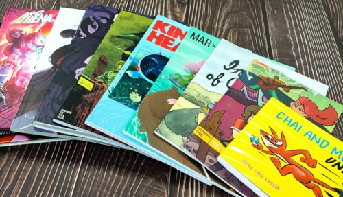
Comic book printed by QinPrinting
Should you print your comic in color or black-and-white?
You have four options to choose from for printing in color or black-and-white:
- Print all pages in full color
- Print the cover in color and the interior in black-and-white
- Print the cover and interior in black-and-white
- Print the cover in color and most of the interior in black-and-white but with color “splash pages” included
A full color comic book will cost more than a black-and-white one. But many wonderful and world-famous comics are published with black-and-white interiors. Some styles, such as the Japanese Manga, are traditionally produced in black-and-white, while others, like the Marvel and DC Superhero comics, are often issued in full color. If it’s your first comic or you need to keep costs down, we recommend a black-and-white interior but jazzed-up with an eye-catching, full color cover front and back.
Best paper for comic books
Your choice of paper for your comic book depends on other printing options — such as size and color, or black-and-white — and considerations of economy. While it’s common to print interiors on lightweight, uncoated paper to save money, if you can afford a little more, an interior printed on heavier, matte coated stock will give a better finish and last longer. As many readers like to carry comics around, stuff them in pockets, and also collect them, making them durable is a good idea. Still, if you’re looking for the cheapest option, 70 gsm / 50 lb offset paper is the lightest you can get away with. If you’re printing a color interior, then a heavier 120 gsm / 80 lb stock is best. Your cover should be heavier paper with a gloss or matte coating to make the colors really pop.
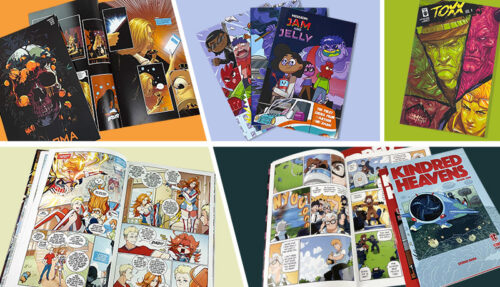
Comic book printed by QinPrinting
Binding options for comic books
In principle, you can choose any binding you like for your comic book. But it’s best to stick to one of the most popular and best binding solutions. These are called “saddle stitched” and “perfect bound”. They each suit a distinct style of comic.
Saddle stitch binding for comic books: when we bind a comic with saddle stitch, we print the pages as sheets which we fold and then stack inside each other before stapling or stitching them together with binding thread.
It’s more common to use metal staples through the “spine” than to stitch these days. Because of how we stack the sheets, saddle-stitched comic books must have pages in multiples of four — with four being the minimum number and up to 64 being a practical maximum, although there will usually be fewer than that. Saddle stitching gives a lightweight, flexible comic and is inexpensive compared to other options. But it’s best suited to shorter books.
Perfect binding for comic books: If you’ve ever seen a paperback book, you’ve seen “perfect binding”.
Hardcover binding a comic book: hardcover binding for comic books is less common, but both independent comic book creators and mainstream publishers alike often use it for special editions, collections, or new releases in an established series.
The binding process is like perfect binding, but we collect the pages into sets called “signatures” before sewing them together and then gluing into a stiff card casing, which we cover with another printed sheet glued to the outer surface to form a hardback book. The cover slightly overhangs the pages. We may also add headbands, endsheets, a dust jacket, a slip case, and a marker ribbon as you wish.
Comic book printing costs chart:
As an indicator of how much it costs to print a comic book, look at the at-a-glance chart. This shows how much you’d pay for a 6.7″ x 10.2″, sewn and perfect bound comic book with 105 gsm / 70 lb art paper for the interior and a gloss laminated 200 gsm / 80 lb cover with gloss lamination.
| Quantity | 100pcs | 200pcs | 500pcs | 1000pcs | 2000pcs |
|---|---|---|---|---|---|
| 40pp | $373 | $440 | $513 | $630 | $918 |
| 44pp | $425 | $499 | $579 | $711 | $1023 |
| 48pp | $418 | $492 | $576 | $706 | $1043 |
| 56pp | $472 | $557 | $653 | $817 | $1196 |
| 64pp | $516 | $609 | $715 | $892 | $1321 |
Price doesn’t include shipping cost
To get an exact quote for your specific comic, you can use our easy Online Print Cost Calculator or just get in touch and one of our experts will be happy to help!

Self-publishing and marketing costs for comics
Creating and printing your comic book is only half the story. If you want to sell it, you’ll need to market and promote it, too. Printing is only one step on the way to publishing. “Publishing” literally means “to make public”. In common use, it signifies getting it out in the world for people to buy. This is a complex area and how and how much marketing and promotion you do depends on many variables: whether you have an established readership and email list or you’re just starting out, who your target readership is, how you want to distribute your comics, and the size of your marketing budget.
You can do all your own marketing and promotion without spending a dime — through a free website and blog, personal contacts, doing workshops and talks at meets and conventions, signings in indie comic stores and book stores and on social media — or you can pay a third-party agency to market and promote your comic book on your behalf. Third-party services can cost anything from $50 for an ad in an email newsletter, to thousands of dollars for a fully coordinated multimedia campaign. But if it’s your first comic book, a mix of free and paid services may be the best bet. You should budget for at least $500 to $1,000 dollars to get the ball rolling.
Comic book printed by QinPrinting
The bottom line
So, how much does it cost to design, print, and self-publish a comic book? As you’ll have figured out by now, the number of variables in play makes it impossible to give a one-size-fits-all answer. But we can give you a range. Assuming you’re starting from scratch with no equipment, no networks, and a limited budget, your start-up costs could be between $1,000 and $5,000 all-in for a short run of 100 copies of a 48-page, perfect bound, color-printed comic book. You could spend less and you could spend a deal more. Many comic book creators — both new and seasoned — run successful crowdfunding campaigns on platforms like Kickstarter to raise the needed capital.
FAQs:
What's the cheapest way to create comic book artwork?
Traditional hand-drawn artwork with basic pencils, pens, and Bristol paper is the cheapest.
Do I need professional equipment to create a comic book?
No, professional equipment helps, but creativity and storytelling quality matter most.
What's the best size for printing a comic book?
6.7″ by 10.2″ is recommended for cost-efficiency and audience familiarity.
Is black-and-white or color printing better for first-time creators?
Black-and-white interiors with a full-color cover are ideal for budget-conscious beginners.
What type of binding is best for comic books?
Saddle-stitch for shorter comics; perfect-bound for professional appearance; hardcover for special editions.
How much should I budget for marketing my first comic?
At least $500-$1,000 is a solid starting point combining free and paid promotion methods.
Can crowdfunding cover the costs of self-publishing?
Yes, platforms like Kickstarter are effective for raising funds for comic creation and printing.
Talk to us — we can help!
At QinPrinting, we’ve enjoyed success in the printing industry for upwards of a quarter of a century. We have a worldwide reputation for excellence, attention to detail, and personal customer service. We have tons of experience making beautiful comic books and graphic novels and the most competitive offset printing prices anywhere.
If you need any further help or advice on designing and printing your perfect comic books, we’re here to help you every step of the way from concept to completion. Contact us now for expert guidance and high-quality design and printing tailored to your specific needs. Just shoot us an email to [email protected] or call us on +1 951 866 3971 and we’ll be delighted to do all we can to help you.
We’d love to help you make your next comic book the best and most successful yet.


8 thoughts on “How Much Does It Cost to Print and Self-Publish a Comic Book?”
Thank you for this breakdown! I'm wanting to help my 8 year old print comic books he's created, and this article gave me a ton more insight into how I can help him sharpen his sword.
Hi Gladys,
Thank you for your comment. Sorry it's taken so long to get back to you. We've been busy printing great comics! We're delighted that this post was helpful and that your son is enjoying creating comic books. It's cool to think we might have played a part in inspiring the next generation of fabulous comic book creators!"
Thanks! Good information! I sent an email with some more questions.
Hi Bob,
You're welcome! We received your email and our experts will contact you. Thank you.
Hey' thanks for y'all information about self publishing technique because I been trying to find a print online demand for years for my most recent comic book that I hand made years ago and thanks
Hi Alonzo,
You're welcome! We are glad we could help you with information on self-publishing your comic book. If you have any more questions or need further assistance with the process, feel free to ask!
Thank you for all that great resource of collated information...
I've decided that I want to self publish my own Comic Book and your website has been very helpful in helping me learn more about the process of getting it printed...
I look forward to using your services in a few years, as I expect it's going to take me a long time to produce it...
But...
I have interest from London, UK graffiti artist 'Cute' to collaborate with me on this project that I'm proposing...
Thank you for helping me to understand a lot more about this...
I'm sure that I will be in contact when I'm ready to try my first sample...
Hi Bevan,
Thank you so much for your kind words! We're thrilled to hear that our resources have been helpful for your comic book journey. It's fantastic that you're pursuing self-publishing, and collaborating with 'Cute' sounds like an exciting opportunity!
Please feel free to reach out whenever you're ready to take the next steps or if you need any further assistance along the way. We are here to support you in any way we can. Best of luck with your project, and we can't wait to see how it all unfolds!