 Custom Card Decks
 Custom Holographic Cards
 Folding Cartons
 Rigid Boxes
 Corrugated Boxes
 Custom Board Game
 Kickstarter Print Solutions
When you're at the stage of formatting or typesetting your self-published book, you'll need to decide on the fonts you'll use for the interior text and for the cover titles. In this easy guide, we share our top tips to make the right choice so you have the best fonts for your book, your readers, and your budget
In the competitive world of self-publishing, every detail matters. From the content to the cover design to the interior layout, every aspect of your book should reflect your creativity and professionalism. One often overlooked but crucial element is the font or the fonts you choose for your book. The right font can make your text more readable, catch the eye of a potential reader, and even reflect the genre, tone, and atmosphere of your book’s content. In this helpful post, we’ll guide you through the factors to consider when you’re thinking about how to choose the best font for your self-published book.
Why fonts matter
Before choosing a font, it’s important to understand why font selection is so important for your self-published book. Fonts play a significant role in creating a cohesive visual identity for your product. Because your book is a product that you want to place and get noticed in the marketplace. It’s also a product that you need to make user-friendly. A well-chosen font can make your book stand out from the competition and make reading your book a pleasanter and more satisfying experience for people who buy it. It’s not just about aesthetics; it’s about creating an immersive reading experience.
Fonts, genre, and reader expectations
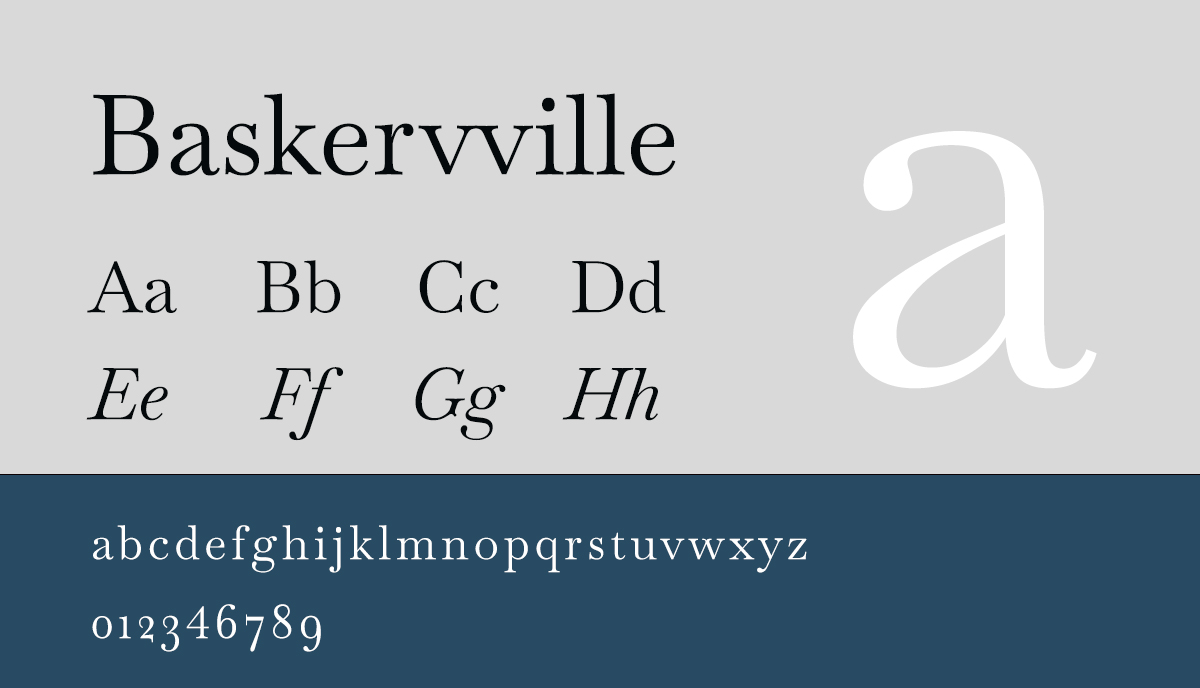
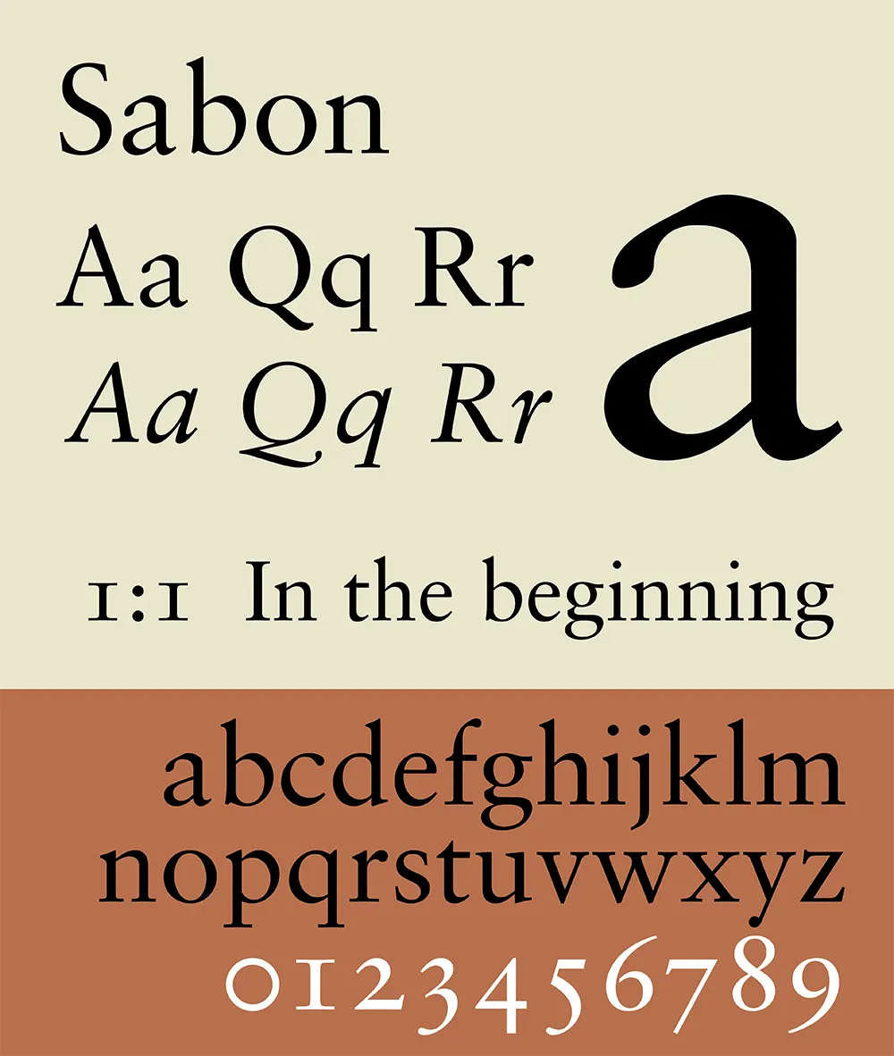
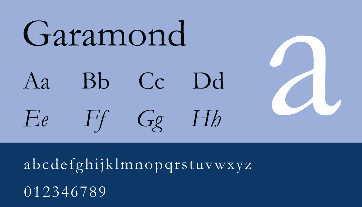
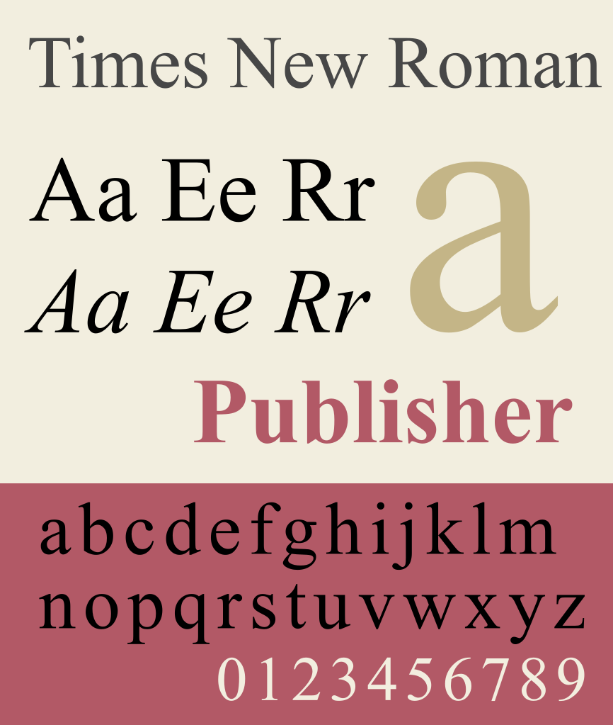
The first step in selecting the perfect font for your book is to consider its genre and topic or subject matter. Different genres and topics call for different fonts to convey the intended message or style effectively. For novels, you may opt for elegant fonts like Baskerville for literary fiction or “feminine” fonts like Sabon for romance novels, for example. Classic fonts like Garamond or Times New Roman are good for fon-fiction books which often require clean and more business-like fonts.
Baskerville font
Sabon font
Garamond font
Times New Roman Font
Demographics of font selection
Understanding your target readership is essential when choosing a font for your self-published book. Besides genre expectations and size considerations—depending on your printing format—you need to think about the age, gender, and reading preferences of your readers. If your target readers are children, you may choose playful, bold, and even irregular fonts to capture their interest, express fun, and make it easier for the very youngest readers to trace the letters on the page or follow them with their fingers. As we’ve seen, the choice of font can also be influenced by the expected style based on the content of your book. And for much older readers, or others who may have sight issues, opt for larger fonts with thicker lines to enhance readability.
It's all about reading
While aesthetics, style, and visual impact are all valid considerations when thinking about how to choose the best font for your self-published book, don’t forget that the most important factor is always how easy it will be to read. Legibility really is paramount for choosing a font for your self-published book. While fancier fonts may be suitable for headlines, chapter titles, and drop capitals, it’s vital to make sure you use more readable fonts for the body of the text.
Fonts with tall x-heights, looser letter spacing, and generous line heights are more readable, especially at smaller font sizes. Also, don’t overuse the italic version and the numbers of the font, as they can significantly affect the overall readability of your book. Occasional use of italics for emphasis may be okay, but long passages can cause eye-strain. If you need to quote a paragraph or more, for example, from another work, use indents and quotation marks rather than italics.
Licencing and legalities
When selecting a font for your self-published book, it’s essential to consider the licensing restrictions. Every commercially available font comes with a license that outlines the specific usage rights. If you will sell your book—which is almost certainly the case—then make sure that the font you choose allows for commercial use. Avoid downloading free fonts from unreliable sources, as they may expose your computer to viruses and potentially violate copyright laws. Look for reputable font providers or consider purchasing a font package to ensure you have the necessary licensing rights. In all cases, always read the EULA (end user license agreement) with care. If there isn’t one easily accessible, then the source is probably illegal and you should avoid it.
Font styles and weights
To add visual interest and differentiation within your book without changing fonts—for titles, headings, subheadings, footnotes, and so on—it’s worth choosing a font that has a range of styles and weights. So, instead of using multiple fonts, which can create a cluttered and unprofessional look, you could choose a single font that offers a variety of visual variations without changing the core style. For example, use the main regular style for the body of the text and medium, semibold, or bold styles for book titles and chapter headings. You can use capitalization and italicization similarly.
Again, you should use capitals and italics judiciously. However, used with care, this approach allows for consistency while providing visual variety and hierarchy within your book’s design. It’s always a good idea to go to your bookshelves at home, to the library, or the high street bookstore, and look through books in your genre, making notes about the font or fonts, the range of styles and weights used, when, and why. This should give you a lot of insight into what will work best for your book.
Print a sample first
It’s always worth experimenting with different fonts at the digital stage of preparing your self-published manuscript for printing. But we strongly recommend that—once you’ve decided on your approach and figured out to your satisfaction with how to choose the best font for your self-published book—to print a sample copy. There’s nothing like seeing the text on the printed page. What may look good on a screen can appear different when printed. If you print your book with us, then we offer a range of proofs and samples, starting with digital proofs in the first stage and ending with a perfect digital print which looks almost identical to your finished offset printed books. When checking your proofs and samples, always pay attention to the numbers, italics, bold, and punctuation marks to ensure they are clear and legible. This hands-on approach will help you make an informed decision about the best font for your book.
If in doubt, ask a designer
If you find selecting the perfect font overwhelming, consider seeking professional assistance. Book designers and typographers have expertise in font selection and can guide you in choosing the most suitable font for your self-published book. They can also provide valuable insights into typography trends and best practices. And of course, you can always talk to us. We have over a quarter of a century’s worth of experience in the offset book printing industry and work every day with mainstream publishing houses and independent creatives alike. We’re always happy to help!
Series, author, and brand identity
What we’ve discussed so far mostly applies to your book’s interior. But the cover obviously plays a huge part in your publication’s success. The font and styles you choose for your cover design play a vital role in your overall branding and visual identity. If you have an existing brand or author platform, choose a font that aligns with your established aesthetic. Consistency across your marketing materials, website, and book design will help establish a strong and recognizable visual and authorial identity. By incorporating fonts that reflect your brand, you create a cohesive and professional image. Look at successful authors who have published dozens of books on the bestseller lists. You’ll notice that you can recognize one of their publications before you even read it—by the branding; the colors, the style, the font, and often an embossed and foil stamped author name or titles.
Choosing the right fonts for your creative projects is an essential aspect of the design process. As a self-publishing author, you’re more than “just a writer”; you’re a creative professional, so you need to understand the importance of selecting fonts that not only convey your message effectively but also enhance the overall aesthetic appeal of your work while increasing your brand strength and recognition of your author name.
The best fonts for creative professionals
We looked at a few of the most popular samples to consider when deciding how to choose the best font for your self-published book. But with countless fonts available, it can be overwhelming to choose the perfect one for your creative projects. To help you in your font selection process, we have curated a list of what we consider the best fonts for creative professionals who want to self-publish, whether you’re writing fiction or non-fiction.
1. Merriweather
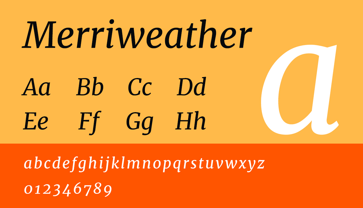
Merriweather, a versatile serif font, offers a balance between elegance and readability. Designed by Sorkin Type, it features a generous x-height and slightly condensed letters, making it space-efficient and legible even at smaller sizes. It is an excellent choice for conveying a sense of authority and professionalism in your designs.
2. Montserrat
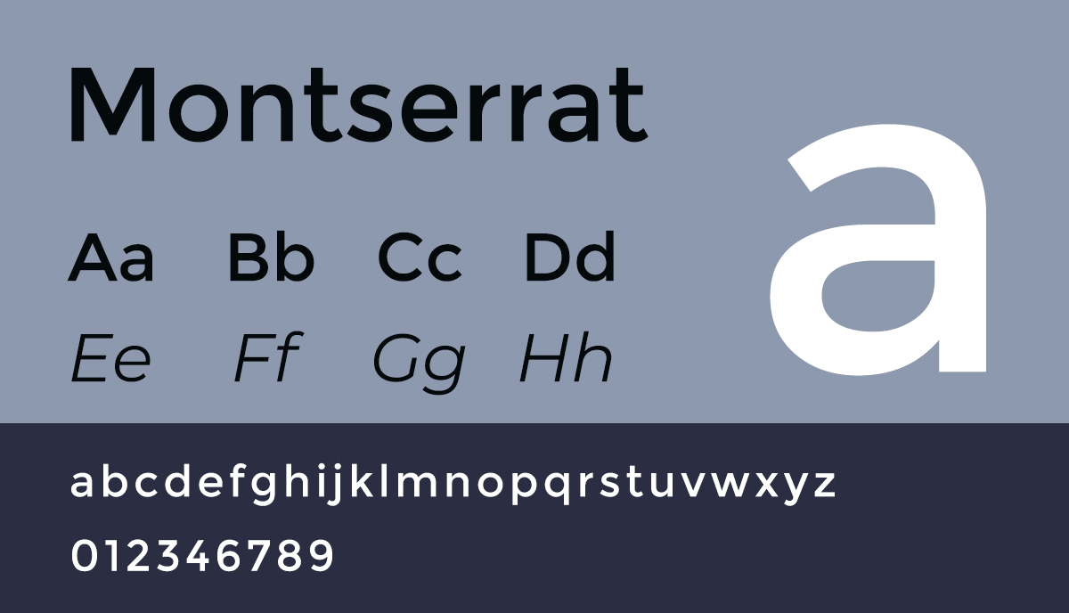
Montserrat, an elegant sans-serif font, is inspired by early 20th-century urban typography. Its geometric structure and wide range of weights and styles make it a versatile choice for various design applications. Montserrat pairs well with both serif and sans-serif fonts, offering endless possibilities for creative combinations.
3. Playfair Display
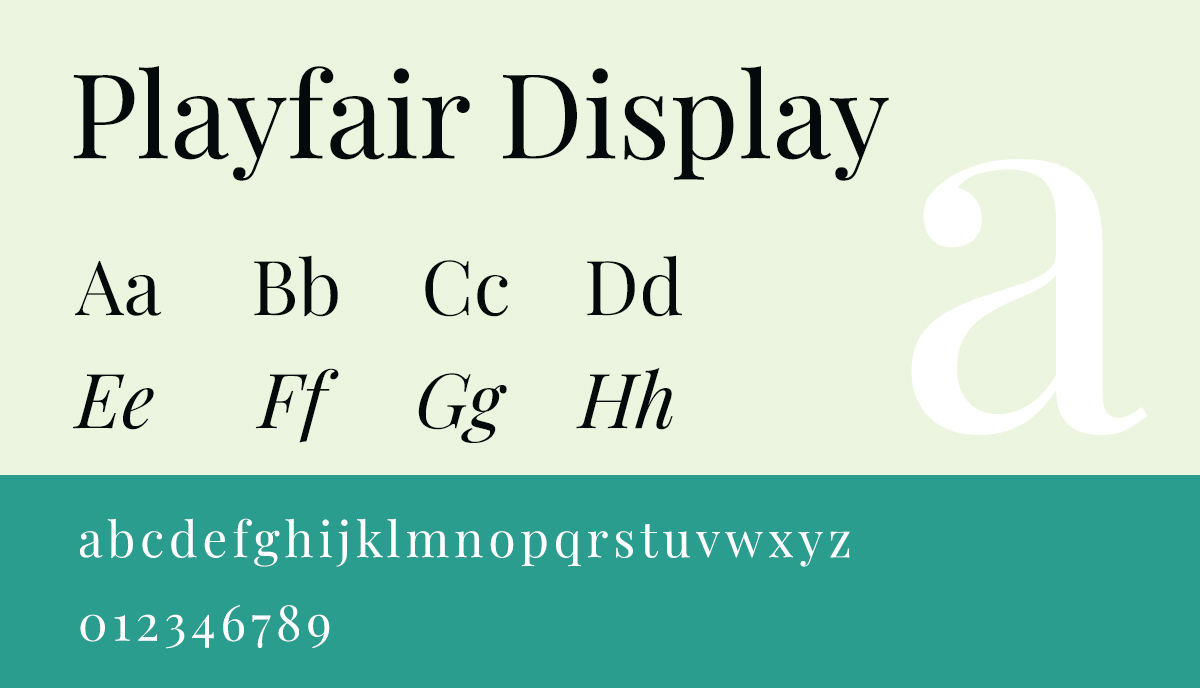
Playfair Display is a high-contrast serif font that adds a touch of sophistication to your designs. Inspired by fonts popular during the Art déco period, it features distinctive letterforms and comes in various styles and weights. Use Playfair Display for headings and titles to make a bold statement in your creative projects.
4. Raleway
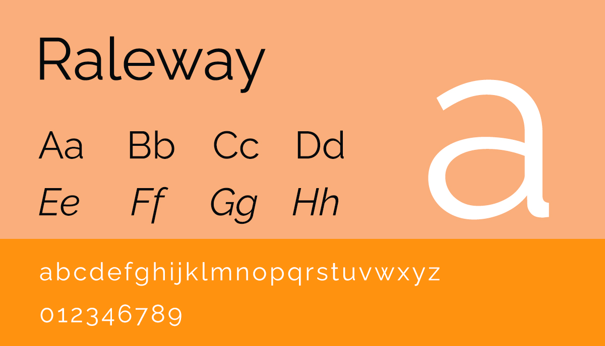
Raleway is an elegant sans-serif font known for its clean and modern aesthetic. Originally designed for headings, they have expanded it into a versatile font family with multiple weights and styles. Raleway’s geometric structure and generous x-height make it an excellent choice for both body copy and headings in your designs.
5. Open Sans
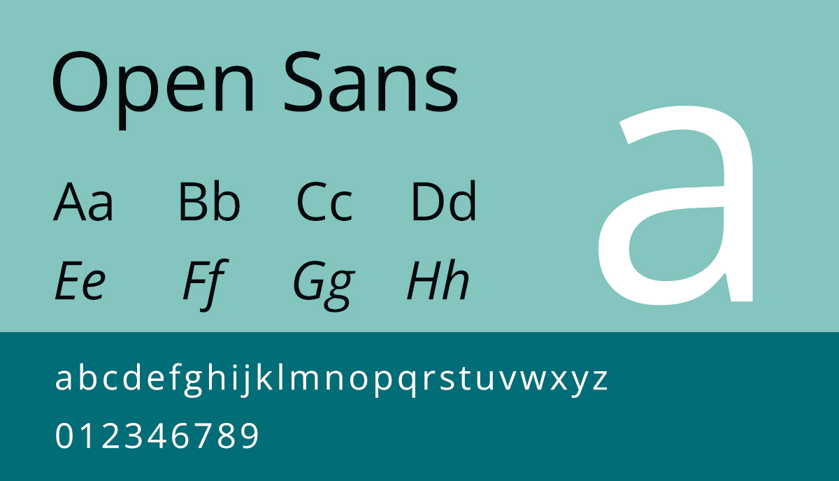
Open Sans is a humanist sans-serif font that combines organic shapes with a handmade feel. Designed by Steve Matterson, it features an extensive character set, including Latin, Greek, and Cyrillic letters. Open Sans is highly legible and adaptable, making it suitable for a wide range of creative projects.
How to pair fonts successfully
Pairing fonts effectively can improve your book designs and help to create a harmonious visual experience for the reader. When combining fonts, you’ll need to think about their contrasting qualities and how they complement each other. Here are some handy tips for successful font pairing:
- Serif with sans-serif: pairing a serif font with a sans-serif font creates a visually appealing contrast. Use a serif font for body copy to enhance readability, and pair it with a sans-serif font for headings and titles to create a hierarchy in your design.
- Contrast in weight: combine fonts with contrasting weights to create visual interest. For example, pair a bold sans-serif font for headings with a lighter serif font for body copy.
- Consistency in style: choose fonts that share similar stylistic elements to maintain a cohesive look. You could achieve this by selecting fonts from the same font family or fonts with similar characteristics.
- Experiment and iterate: don’t be afraid to experiment with different font combinations and iterate until you find the perfect pairing. Trust your creative instincts and ask for feedback from peers or clients to refine your choices.
As a creative writer and independent publishing professional, the fonts you choose have a significant impact on the success of your book designs. By prioritizing and balancing both readability and aesthetics, and taking into consideration both the mood and message you want to convey, you can select fonts that enhance your self-published book’s appearance and the ease of the reading experience for your readers. Remember to feel free to experiment, explore different combinations, think about your genre, the readers’ expectations, and trust your creative instincts to choose the best font for your self-published book.
In short, just picking a font you like the look of won’t cut the mustard! When you explore how to choose the best font for your self-published book, you need to think about a lot of factors. But by understanding the importance of font selection and following the guidelines outlined in this post, you’ll be on the right lines. Remember, fonts are not just decorative elements; they are powerful tools that can enhance your storytelling and establish your credibility as a professional author.
Talk to us!
At QinPrinting, we’ve been successful in the offset printing industry for over 25 years. We know what we’re talking about and we know what we’re doing. When you’re ready to begin your self-published book design, talk to us first. We work with mainstream publishing houses and independent authors, giving the same unbeatable level of service to both. There are a multitude of ways we can get you started along the right track to success, including expert advice about sizes, paper choices, coatings, finishes, and lamination to binding and packaging options and everything in-between. We can liaise with your design team to keep everything on track and even provide custom book templates tailored to your project. Get in touch today to discuss your needs or ask us for a no-obligation quote. We can’t wait to help you create a book that reallt stands out from the crowd!