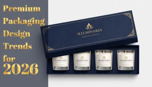
Here’s a secret the big candle brands don’t want you to know: that $65 candle in the gorgeous box? The packaging probably cost them less than $2 per unit.
Premium packaging isn’t about spending more—it’s about spending smarter. The difference between a box that looks “homemade” and one that looks “luxury boutique” often comes down to a few strategic design decisions, not a bigger budget.
This guide shares practical design ideas that create maximum visual impact without maximum cost. Whether you’re launching your first candle line or looking to upgrade your existing packaging, these strategies will help you create custom candle boxes that punch way above their price point.
What Actually Makes Packaging Look Expensive?
Before diving into specific ideas, let’s understand what creates the perception of premium. It’s rarely about expensive materials—it’s about:
- Restraint— Fewer elements, executed well, beats busy design every time
- Contrast— Strategic use of one standout element against simplicity
- Typography— Good fonts, properly spaced, signal sophistication instantly
- White space— Breathing room looks confident; crowding looks cheap
- Consistency— Aligned elements and intentional details show care
- Touch— Even one tactile element elevates the entire experience
The good news? None of these require premium pricing. Let’s look at how to achieve each one on a budget.
10 High-Impact, Low-Cost Design Ideas
1. Full Color Printing on C1S Paper
Cost impact: Often the same price as one or two-color printing
Here’s a surprise: full-color CMYK printing isn’t the expensive upgrade many people assume. Modern offset printing uses a four-color process regardless of whether you’re printing one color or a thousand—so a vibrant, photo-quality design costs roughly the same as a simple two-color layout. Pair it with C1S (coated one side) paperboard and matte or gloss lamination, and you’ve got a professional, retail-ready box at entry-level pricing.
How to execute:
- Use high-resolution images (300 DPI) for sharp reproduction
- Take advantage of the full color palette—gradients, photography, and detailed illustrations are all “free” once you’re printing CMYK
- Add matte lamination to protect the print and elevate the feel
- C1S paperboard gives you a smooth, bright white surface that makes colors pop
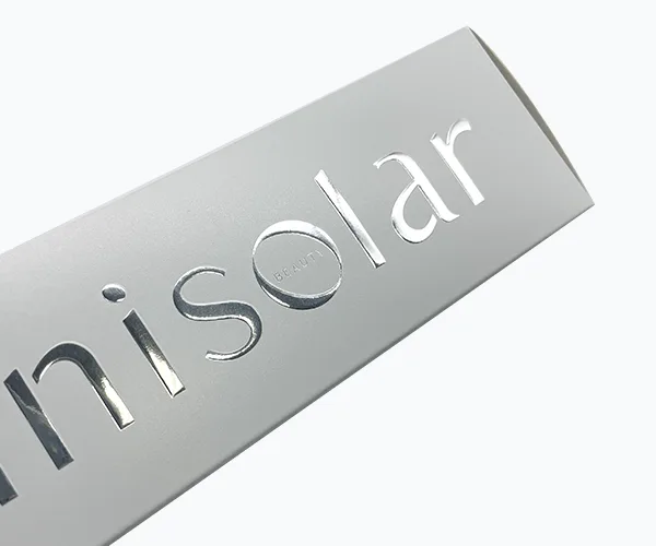
2. Strategic Foil Stamping (Less Is More)
Cost impact: $0.07–0.3 per box for small logo/accent
Foil stamping sounds expensive, but the cost is based on the size of the stamped area—not whether you use it at all. A small foil logo or subtle accent line can cost just pennies per box while creating that unmistakable luxury shimmer. The key is restraint: one small foil element on an otherwise simple box looks intentional and premium. Foil everywhere looks like you’re trying too hard.
How to execute:
- Foil just your logo, a small icon, or a single accent line
- Pair with matte or uncoated paper for maximum contrast
- Gold and rose gold read “luxury”; silver reads “modern”; copper reads “artisan”
3. Matte Lamination (The Budget Luxury Hack)
Cost impact: Adds $0.02–0.15 per box
If you can only afford one upgrade, make it matte lamination. It’s the single most cost-effective way to make packaging feel premium. Matte lamination creates a smooth, velvety surface that customers instinctively want to touch. It also protects against scuffs, resists fingerprints, and photographs without glare—perfect for social media.
How to execute:
- Apply to the entire exterior for a cohesive feel
- Pairs beautifully with spot UV or foil accents (the contrast is striking)
- Works on any color—but especially dramatic on darks

4. Interior Surprise (Double-Sided Printing)
Cost impact: Adds $0.05–0.12 per box
Printing on the inside of your box costs almost nothing extra but creates a memorable unboxing moment. When customers open a simple exterior and discover a beautiful pattern, message, or brand story inside, it feels like a gift. This “hidden” detail gets shared on social media constantly.
Ideas for interior printing:
- A pattern that reflects your scent (florals for floral scents, geometric for modern brands)
- “Light this when…” followed by moments that match your scent mood
- The scent story or ingredient illustrations
- A simple “Thank you” in beautiful typography
- Care instructions designed beautifully, not as an afterthought
5. The Minimalist Typography Approach
Cost impact: $0 extra—just smart design
Great typography costs nothing but makes everything look more expensive. Strip your design down to just your brand name, scent name, and weight—nothing else on the front. Use a premium font (many are free), generous spacing, and perfect alignment. This “less is more” approach signals confidence and lets customers focus on what matters.
How to execute:
- Invest time (not money) in font selection—Google Fonts has excellent options
- Increase letter spacing slightly for an editorial feel
- Align everything to a grid; inconsistency looks amateur
- Put secondary information (ingredients, warnings) on the bottom or back
6. Spot UV on Matte Lamination Plus Emboss
Cost impact: $0.06–0.3 per box (combines two techniques for maximum impact)
This is the power combo for candle brands that want to look ultra-premium without rigid box pricing. Start with a matte laminated base—velvety and sophisticated—then add spot UV to make your logo or a pattern pop with high-gloss shine. Layer in a blind emboss on the same area, and now your logo isn’t just shiny, it’s raised and tactile. Customers will run their fingers over it instinctively. The contrast between matte, gloss, and texture creates visual and tactile depth that photographs beautifully and feels expensive.
How to execute:
- Apply spot UV and emboss to the same element (usually your logo) for a “3D glossy” effect
- Keep the rest of the box matte to maximize contrast
- Works especially well on dark colors—black with glossy embossed logo is a classic luxury look
- This combination hits the “High” to “Very High” premium perception tier while staying under $1.50/unit
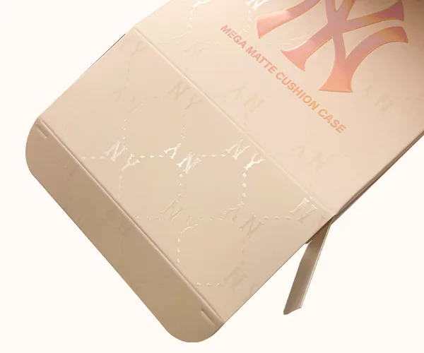
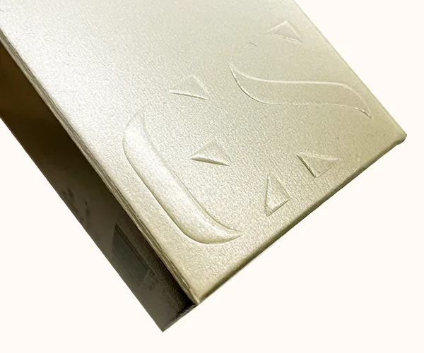
7. Emboss or Deboss Without Ink (Blind Technique)
Cost impact: $0.03–0.20 per box (die cost spread across quantity)
Blind embossing (raising) or debossing (pressing in) creates a textured impression without any ink or foil. The effect is subtle and sophisticated—customers discover it by touch rather than sight. It works beautifully for logos, patterns, or borders, adding dimension without adding visual clutter.
How to execute:
- Use on your logo for a subtle, tactile brand moment
- Add an embossed border or frame around your design
- Create a pattern that catches light at certain angles
- Pair with matte lamination for a velvety raised effect
8. Let the Product Shine with Cut-Out Windows
If your candle jars are beautiful—perhaps they have a unique color or a lovely label—why hide them?
Die-cutting a “window” into your box serves two purposes:
- Trust: Customers can see exactly what they are buying (and smell the scent more easily).
- Design Depth: It creates a 3D effect without needing extra material.
You can design the window in a shape that matches your brand (like a teardrop, a circle, or a geometric arch). This turns a standard square box into a custom piece of art.
9. Smart Use of Stickers and Seals
Cost impact: $0.04–0.15 per unit for custom stickers
Custom stickers or seals let you add premium touches to simpler base packaging. Order boxes in larger quantities (lower per-unit cost) and use stickers to customize for different scents, seasons, or limited editions. A foil seal closing the box, or a round logo sticker on the front, can transform a basic box into something special.
How to execute:
- Use a circular seal to close the box—it adds a “breaking the seal” ritual
- Foil stickers are surprisingly affordable and look luxurious
- Change sticker designs seasonally while keeping box design constant
- Add a “handwritten” thank you sticker for personal touch
10. The Sleeve + Simple Box Combo
Cost impact: Can actually save money vs. one premium box
Instead of one expensive box, consider a simple inner box with a decorative outer sleeve. The sleeve carries your branding and design; the inner box is plain but functional. This approach lets you invest in printing quality where it matters (the sleeve) while keeping structural costs down. Plus, removing the sleeve becomes part of the unboxing ritual.
How to execute:
- Make the sleeve the visual star—this is where you can use foil or special printing
- Keep the inner box a coordinating solid color
- The sleeve can change seasonally while the box stays constant (inventory flexibility)
Where to Spend (And Where to Save)
Worth the investment:
- Number of colors—Full CMYK
- Matte or soft-touch lamination—Biggest impact for smallest cost
- Good typography and design—Free but invaluable
- One premium finish (choose: foil OR emboss OR spot UV)
- Interior printing—Low cost, high surprise factor
- Quality paperboard (350gsm minimum)—Don’t go flimsy
Okay to save on:
- Complex die cuts—Standard shapes with great design beat fancy shapes with poor execution
- Multiple finishes—Pick one hero technique, not all of them
- Interior structure—Simple is fine if exterior is strong
Design Combinations by Budget
Budget-Friendly
Full color print on C1S cardstock + lamination
Mid-Range Premium
Colored paper + small gold foil logo or corrugated box
Investment Pieces
Cardboard stock + more surface treatments or rigid box
Mistakes That Make Packaging Look Cheap
Avoid these—they’ll undermine even good design:
- Too many fonts— Stick to two maximum, one is often enough
- Crowded layout— When in doubt, add more white space
- Cheap-looking stock imagery— Either use original photos or skip imagery entirely
- Thin, flimsy paperboard— 300gsm minimum, 350gsm preferred
- Misaligned elements— Everything should snap to a grid
- Glossy everything— Gloss lamination can look dated; matte reads more premium
- Inconsistent branding— Your box should match your website, labels, and marketing
Your Budget-Friendly Design Checklist
- Have I chosen ONE hero design element to invest in?
- Is my typography clean, well-spaced, and professional?
- Does my design have enough white space to breathe?
- Is there a tactile or surprise element (even a small one)?
- Will this photograph well without glare?
- Have I avoided the “trying too hard” trap of too many finishes?
- Have I ordered samples to test the actual feel and quality?
Ready to Create Your Premium Candle Boxes?
Looking premium doesn’t require a premium budget—it requires smart decisions. At QinPrinting, we help candle brands find the right combination of materials and finishes to maximize impact within their budget. Explore our custom candle box options or reach out for a custom quote with recommendations tailored to your brand and price point.