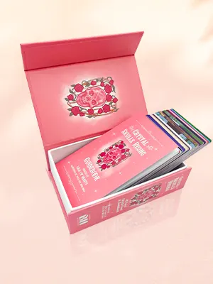
 Custom Card Decks
 Custom Holographic Cards
 Folding Cartons
 Rigid Boxes
 Corrugated Boxes
 Custom Board Game
 Kickstarter Print Solutions
Designing your own book cover can be a rewarding and cost-effective option. We guide through the fundamentals to help you produce a beautiful and effective design.
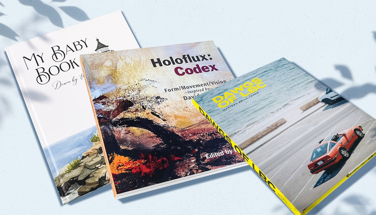
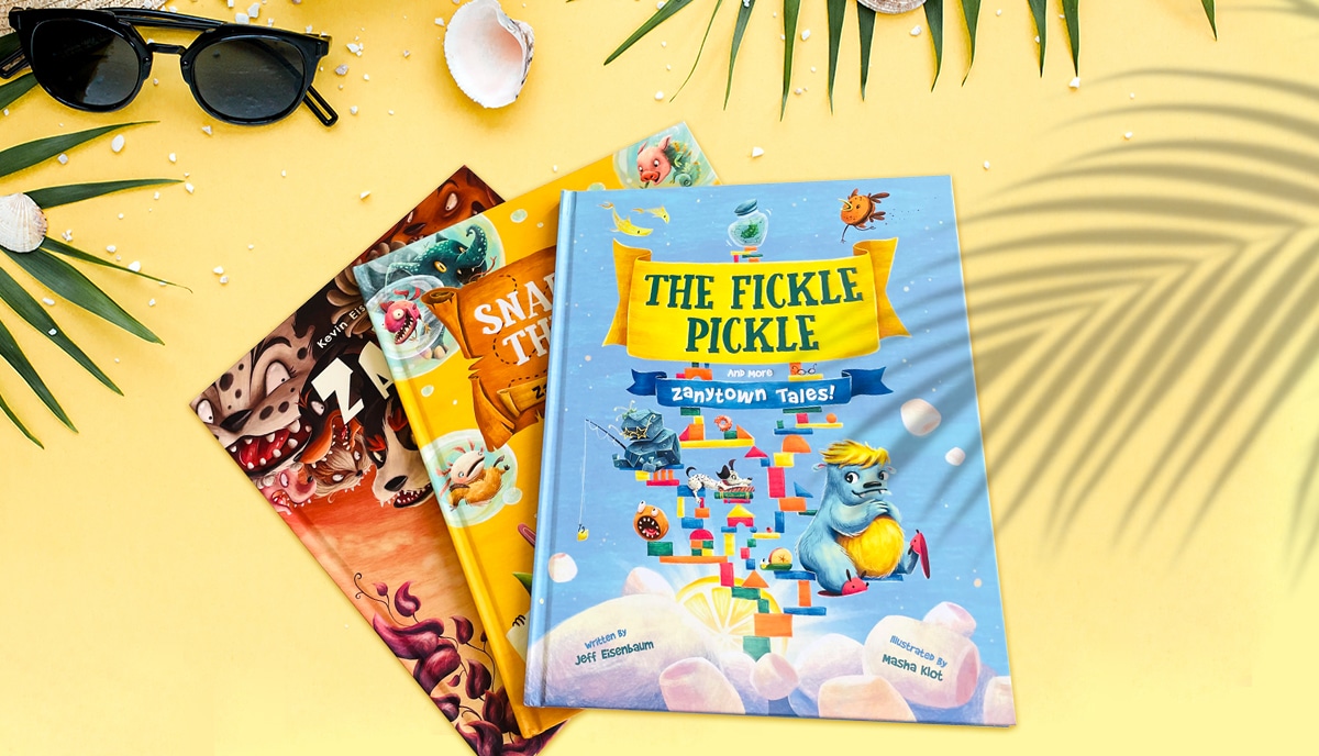
As a major international offset printer with a global reputation for excellence built over 25 years of success in the industry, we know the importance of a great book cover. A well-designed cover will attract readers, communicate the book’s genre, and encourage the browser — whether online or in the bookstore — to open the covers and check out what’s inside. We often work with self-publishers and independent creatives and we know that designing your own book cover can be a fulfilling and rewarding experience. But we also know that it can be complex and challenging. So to help you get it right , we’d like to guide you through the process step by step, from the principles of book cover design to sourcing images and avoiding common mistakes. So, let’s get started!
Why design your own book cover?
Before diving into the design process, it’s crucial to understand the benefits of designing your own book cover. There are several reasons, and you may have others that aren’t listed here. But if it’s your first time designing a book cover, be prepared for a learning curve.
- Firstly, it gives you complete creative control over the final product, which is often stated as the single most important factor by self-publishers we work with. After all, one of the reasons you choose to self-publish is so that you can exercise your creativity without interference. You can choose the colors, typography, and imagery that best represent your book’s story and genre.
- Secondly, it can save you money. And for most self-publishers keeping the investment margins as low as possible — without sacrificing quality — is vital to pushing up the profit margins. Hiring a professional book cover designer can be expensive, especially for indie authors or small presses on a tight budget. Designing your own cover can be cost-effective and still yield a professional-looking result so long as you put in the time and dedication to learning how to do it right.
- Lastly, designing your own cover can be a fun and rewarding process. It’s a chance to flex your creative muscles and bring your book’s essence to life. Our clients are all creative people who love new challenges and designing your own book cover can bring immense creative satisfaction.
Principles of book cover design
To design a great book cover, you need to understand the principles of book cover design. While each of these core principles needs more in-depth study and experimentation, it will help to get an overview right now. So, here are the most fundamental factors to consider:
- The cover should be eye-catching, legible, and relevant to the book’s genre. So, a simple, striking image and bold, visible title are a must. A common mistake is to feel constrained to show a scene from the story. But you needn’t do that. It’s more important to convey clearly the genre and style of the book to attract the reader most likely to enjoy the book.
- It should be designed with the target audience in mind. While you must be creative, you also need to understand what works and doesn’t work in your genre. It’s a fine balance, but if you want your book to sell, it’s a good idea to think about reader expectations and what’s already working well in the marketplace as well as your personal creative vision.
- A great book cover should also be scalable, meaning it should look good in both print and digital formats. You want the cover to look great in a bookstore stand. But at the same time, as most of your sales will likely be online, it needs to be captivating, clear, and convincing when its just a tiny thumbnail on a computer screen.
- You should learn and employ the fundamental understanding of how images and typography, colors and forms, interact in the layout. We’ll look at these ideas in a bit more detail shortly.
When designing your cover, keep these principles in mind to create a compelling and effective design. We’d always recommend browsing the top-selling books in your genre and making notes about the designs, layouts, colors, and typography used on their covers. Not that you should imitate or plagiarize, but there’s a lot you can learn from what’s already working well.
Book cover layout options
The layout of your book cover is essential in catching the reader’s attention. There are several layout options to choose from, including a single image cover, a typography-based cover, or a combination of both. A single image cover features a prominent image — which may be artwork or photography or a digitally manipulated mash up of both — that represents the book’s genre. A typography-based cover uses typography to convey the book’s essence, with little or no imagery. A combination of both — which is by far the most common choice — uses a mix of imagery and typography to create a visually appealing cover. When choosing a layout, consider the balance between image and text. Will the title be bigger or the author’s name? Will the title go at the top or bottom? Will you include other text such as press quotes or a tagline? Will the image wrap across both the front and back covers or will you use different images? What about the spine?
Using contrasting and complementary colors in book cover design
Color is a powerful tool in book cover design. It can evoke emotions, set the tone, and communicate the book’s genre and what the reader can expect from the story. When designing your cover, consider using contrasting and complementary colors to create a visually striking result. Contrasting colors are colors that are opposite each other on the color wheel, such as blue and orange or red and green. Using contrasting colors can create a vibrant and eye-catching cover but you must be careful not to generate a contrast which is too strong or “clashing”. Complementary colors are colors that are next to each other on the color wheel, such as blue and green or red and orange. Using complementary colors can create a harmonious and balanced cover. When using color, be careful not to overdo it. If you study professional book cover designs, you’ll usually find that they’re based on a dominant two-color scheme. That’s a good rule of thumb to follow.
Choosing the right fonts and typography
Typography plays a crucial role in book cover design. When choosing the right fonts and typography, consider the book’s genre and storyline. For example, a horror story might use bold, gothic fonts, while a romance novel might use flowing, cursive fonts. Be sure to choose legible fonts that are easy to read, especially in thumbnail size. Avoid using too many fonts or fonts that clash, as it can make the cover look cluttered and confusing.
Adding ISBNs and barcodes to your book cover

Before publishing your book, you’ll need to add an ISBN and barcode to your cover. An ISBN (International Standard Book Number) is a unique identifier for your book, while a barcode is a scannable code that contains the book’s ISBN and price. You can purchase an ISBN from your country’s ISBN agency or from a third-party provider. In the US, you can purchase ISBNs from Bowker and in the UK, from Nielsen. This unique number allows for accurate tracking and marketing for your book and is necessary if you want to get it into the catalogs from which physical bookstore owners and others — such as libraries and schools — choose the books they buy.
You can generate a barcode using a barcode generator tool or software or we can generate one for you. When adding an ISBN and barcode to your cover, be sure to place them in a visible and unobtrusive area, such as the back cover or bottom right corner of the front cover.
What to include in your book cover design
When designing your book cover, there are several elements to consider including. Most of them may be obvious. Others less so. We’ve seen successful book cover designs that had multiple elements and equally successful ones that were strictly minimalist. But these are the most common elements you may wish to include:
- The book’s title
- The author’s name
- A subtitle
- A tagline
- Review quotes
- A “blurb”
- A logo
- ISBN and barcode
As a rule — unless you’re a famous author whose name alone will sell the book — the title should be the most prominent element on the cover, with the author’s name and subtitle placed in a smaller size. A tagline can be used to convey the book’s essence or theme or build intrigue, while a well-written blurb can entice the reader to open the book and read more. When including these elements, be sure to place them in a logical and visually appealing way that enhances the cover’s overall design.
Common book cover design mistakes to avoid
When designing your book cover, it’s important to avoid common design mistakes that can detract from the cover’s effectiveness. These include:
- Using too many fonts or colors
- Using low-quality images or artwork
- Placing text in hard-to-read areas
- Misrepresenting the book’s genre
Be sure to keep the cover simple and uncluttered, using only essential elements to communicate what the book is about and the kind of reading experience it can offer. If in doubt, always err on the side of simplicity. Again, study the market to get ideas and inspiration.
Sourcing images, artwork, and photographs for a book cover
When designing your book cover, it’s essential to use high-quality images, artwork, or photographs. You can source these from stock image websites, hire a professional illustrator or photographer, or create your own artwork. When using stock images, be sure to choose ones that are relevant to the book’s genre and story and avoid using cliché or overused images. When hiring a professional, be sure to communicate your vision clearly and provide them with a detailed brief. And always make sure that you have the rights to use any images you want in your cover design for commercial purposes. Copyright and plagiarism laws should be taken seriously and infringement could result in a costly lawsuit and severe damage to your reputation.
What makes a successful book cover design?
A successful book cover design is one that catches the reader’s attention, conveys the book’s genre and story, and entices them to pick up the book and read more. It should be visually appealing, legible, and relevant to the target audience. A successful cover should also be memorable, making the book stand out from others in its genre. When designing your cover, keep these elements in mind, and aim for a design that is both visually striking and effective in conveying the book’s essence. Remember to keep the design simple, use high-quality images and typography, and avoid common design mistakes. With these tips in mind, you can bring your book cover design ideas to life and make your book stand out in a crowded market.
Let's talk!
A QinPrinting, we’ve been printing successful books for self-publishing authors and independent creatives, not to mention businesses and non-profits, for over 25 years now. We’ve established an expert and enthusiastic team with a knowledge about book design for self-publishers that is both broad and deep. We also have our own specialist in-house designers. If you’ve written a book from start to finish, that’s already a tremendous achievement. Don’t let your book down by failing now in designing it for print. We have a range of custom designed book templates to help you get started and we are always happy to talk you through the nuts and bolts of good book design. Just talk to us. We are here to help. You can easily get in touch by telephone, email, the live chat, Skype, or the online contact form. We look forward to working with you.