 Book Printing in China
 Custom Card Decks
 Custom Holographic Cards
 Free Wall Calendar Template
 Free Desk Calendar Template
 Folding Cartons
 Rigid Boxes
 Corrugated Boxes
 Custom Board Game
 Custom Card Game
 Kickstarter Print Solutions
When you format a book or write a novel on your computer, the font size you choose may look different on screen from how it looks on paper. A 12 pt font does not always appear the same across typefaces, and the letters’ visible height is not the same as the point size.
Understanding what pt means can help you make more informed choices when preparing text for print.
What Does “pt” Mean in Font Size?
Pt stands for point, a unit used to specify type size in print and desktop publishing. In modern desktop publishing, one point is generally defined as 1/72 of an inch, or about 0.353 mm.
This measurement describes the type size, but it does not mean that every letter is exactly that tall. A font’s point size sets the scale for its design; the visible letters occupy only part of that space. So, for example, 12 pt type does not produce letters that are all 12 points high.
Why Do Fonts Look Different at the Same Point Size?
Two typefaces set at the same point size can look noticeably different. Their letter proportions, stroke shapes, spacing, and x-height—the height of a lowercase “x”—affect how large the text appears.
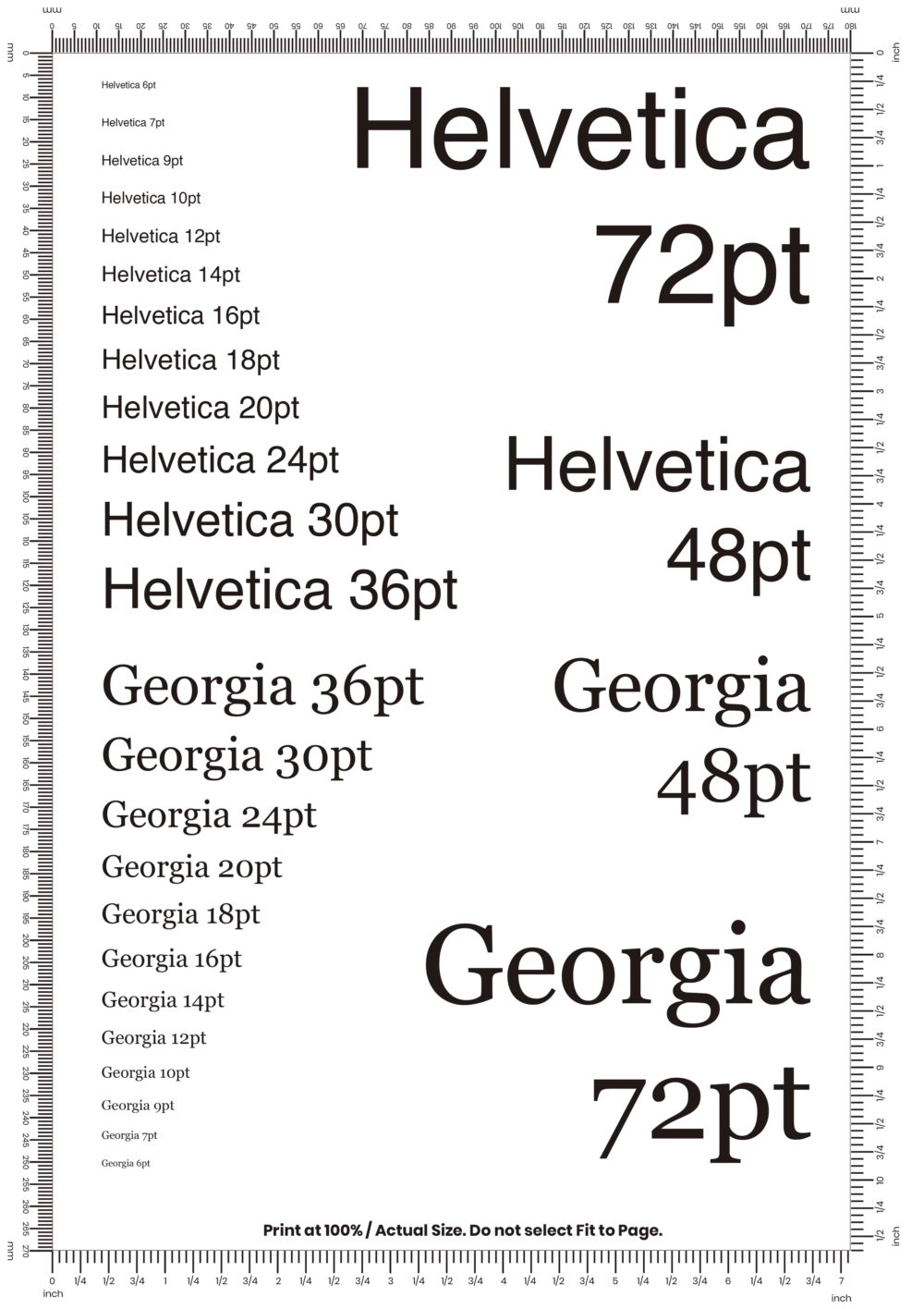
For example, 12 pt Helvetica and 12 pt Georgia share the same nominal point size, but their letters may not look equally tall or prominent on the page. Serif and sans serif styles can also create different visual impressions. That is why the point-size number alone cannot tell you exactly how a typeface will look in print.
What Font Size Is Common for a Printed Book?
Printed book body text often falls around 10–12 pt, with the final choice depending on the typeface, book size, line spacing, and intended readers. This is a useful starting range, not a universal rule. A font that looks comfortable at 10 pt may feel small in another typeface or on a different page size.
When writing a novel manuscript, the formatting requirements may differ from those of the finished book. A manuscript is prepared for editing and review; the printed edition is typeset for readers. The font size used in a manuscript does not necessarily determine the size used in the published book.
Downloadable Font Size Comparison PDF
To make it easier to compare point sizes visually, this article includes a downloadable PDF showing several sizes in Helvetica and Georgia. It offers a quick reference for seeing how different typefaces can look at the same nominal size.
Frequently Asked Questions
How big is 1 pt when printed?
One point is generally 1/72 of an inch, or about 0.353 mm. This describes the type size, not the exact visible height of a printed letter.
Is 12 pt the same size in every font?
No. The point-size setting is the same, but typefaces have different proportions and letter heights. As a result, 12 pt in one font may look larger or smaller than 12 pt in another.
What is a typical font size for book text?
A common starting range for printed book body text is 10–12 pt. The best choice depends on the typeface, page dimensions, spacing, and reader needs.
Does font size on screen match print size?
Not necessarily. The apparent size on screen depends on zoom level and display settings. The point-size setting describes the type size in the document, while a printed page shows how the text appears at its output size.