 Book Printing in China
 Custom Card Decks
 Custom Holographic Cards
 Free Wall Calendar Template
 Free Desk Calendar Template
 Folding Cartons
 Rigid Boxes
 Corrugated Boxes
 Custom Board Game
 Custom Card Game
 Kickstarter Print Solutions
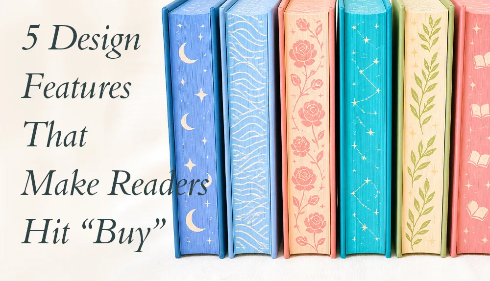
Special edition books are designed to be more than books. They are objects readers want to collect, display, and share online.
That is why most premium special editions are produced as hardcover books. A hardcover provides the structure needed for decorative finishes, while also giving the book the weight and durability readers associate with a collectible product. More importantly, it offers multiple surfaces to design—from the cover and spine to the page edges and endpapers.
For publishers and independent authors, the goal is not simply to add as many premium finishes as possible. The most successful editions create a sequence of visual reveals that works naturally on camera. Here are five design features that can turn a hardcover book into something BookTok readers immediately want to own.
1. Painted Edges Turn the Closed Book into an Illustration
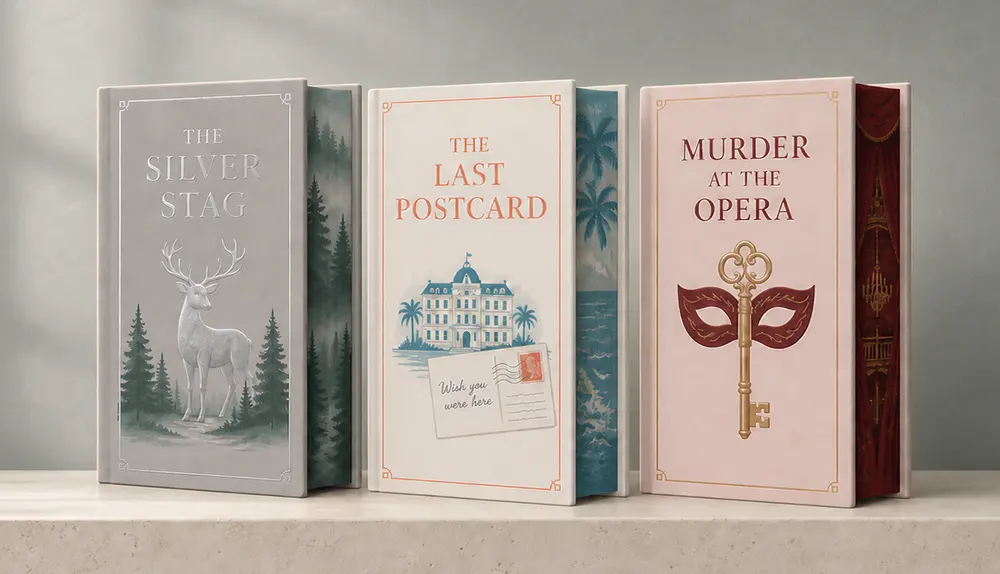
Painted edges are one of the most recognizable features of modern special edition books. Instead of treating the page edges as an empty surface, designers use them to extend the visual world of the story.
A fantasy novel might feature a castle, forest, or magical symbol across the edge. A romance title could use flowers or imagery associated with its central relationship. When the book is closed, the artwork appears as a complete image; when it is opened, the image disappears between the pages.
That transformation makes painted edges especially effective on BookTok. A creator can reveal the artwork by simply rotating the book, giving the video an immediate focal point without needing elaborate staging. The strongest designs are not merely decorative—they give viewers a recognizable glimpse of the story before the book is opened.
2. Panoramic Edges Make Readers Want the Complete Series
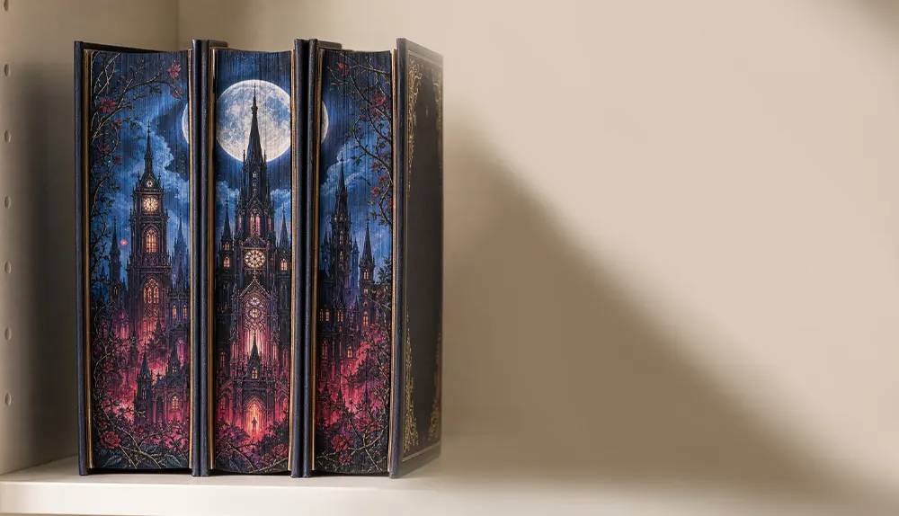
For a multi-book series, painted edges can become even more compelling when the individual volumes form one continuous illustration.
Each book carries part of the artwork, but the complete scene only appears when the series is placed together. A trilogy might form a single landscape, while a longer fantasy series could reveal a map or a lineup of major characters.
This approach gives readers a visual reason to complete the collection. It also creates a natural BookTok moment: the books can be placed on the shelf one by one until the full image is revealed. The design therefore supports both collecting and social sharing, while giving the series a strong identity when displayed together.
3. Foil and Embossing Create Movement Across the Cover
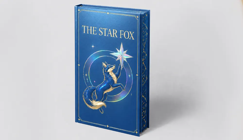
Painted edges attract attention from the side, but the hardcover itself still needs to feel special. Large-scale foil stamping is particularly effective because it changes as the book moves under the light.
Foil can be applied across the front cover, back cover, and spine to create one continuous design. Gold remains popular, but silver, copper, colored metallic and holographic foils can produce a more distinctive result when they match the tone of the story.
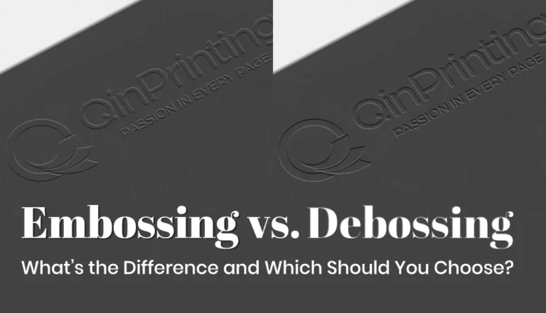
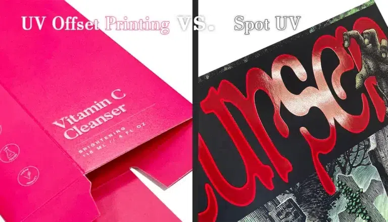
The effect becomes richer when foil is combined with another finish. Embossing can raise selected details above the cover, while debossing presses them into the surface. Spot UV can add a glossy layer to specific areas. Used together carefully, these techniques create depth, contrast, and reflection—the qualities that become visible when a BookTok creator tilts the book toward the camera.
The key is hierarchy. One or two coordinated finishes usually look more premium than covering every part of the book with competing effects.
4. Gilded Edges Add an Immediate Sense of Luxury
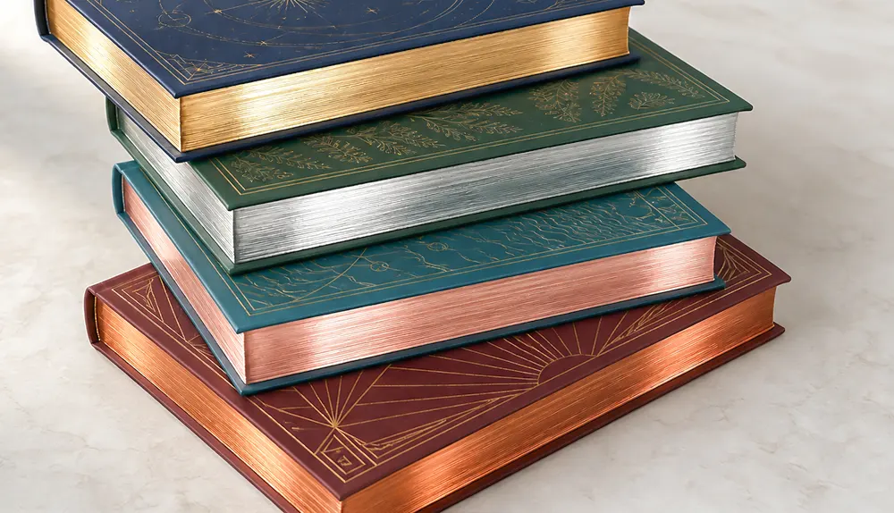
While painted edges communicate story, gilded edges communicate luxury.
Gold, silver, rose-gold, or holographic page edges catch the light as the book is moved. The effect is simple, but it immediately distinguishes the edition from an ordinary hardcover. It works especially well for classic literature, historical fiction, gothic novels, and books with an elegant or ceremonial visual identity.
Gilded edges are also highly camera-friendly. Their reflective surface may appear subtle on a product page, but it becomes much more dramatic in an unboxing video. A slow turn of the book is enough to reveal the metallic shine, giving creators an easy visual moment to capture.
For that reason, gilding should be chosen as part of the book’s overall design language. When the edge color echoes the foil on the cover or spine, the entire edition feels deliberate rather than simply expensive.
5. Illustrated Endpapers Reward Readers for Opening the Book
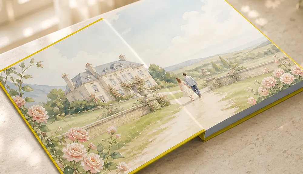
The final reveal should happen when the cover is opened.
Full-color illustrated endpapers can feature a map, landscape, character scene, or another image connected to the story. Because the artwork spans two pages, it can feel more immersive than a conventional cover illustration.
Endpapers also bring narrative rhythm to the physical book. The exterior creates the first impression, the page edges build anticipation, and the interior artwork welcomes the reader into the story. In an unboxing video, this gives the creator one more discovery to share after showing the cover and edges.
The best illustrated endpapers do not repeat the cover. They reveal something new—an environment, relationship, or hidden detail that makes opening the book feel rewarding.
A Special Edition Should Feel Like One Complete Design
A successful special edition is not created by placing unrelated premium finishes on the same book. Its value comes from the way those details work together.
The cover establishes the visual identity. Foil and embossing add movement and texture. Painted or gilded edges make the closed book worth displaying. Illustrated endpapers complete the experience when it is opened.
This is also why hardcover binding is so important. It provides a durable foundation for these processes and gives the finished book the presence expected of a collectible edition.
For BookTok audiences, every surface becomes part of the story—and every reveal creates another reason to stop watching, look closer, and hit “Buy.”
Create Your Own Special Edition Hardcover
Premium finishes do not always require a premium-sized budget. Depending on the specifications and order quantity, many of these processes add only $0.10–$2.00 per copy. We can combine them into a custom hardcover special edition based on your artwork, audience, and budget. View our quotation page to compare the available options.