Prepress Artwork
A quick, easy-to-understand introduction to everything you need to know to prepare your artwork and layouts for offset printing.
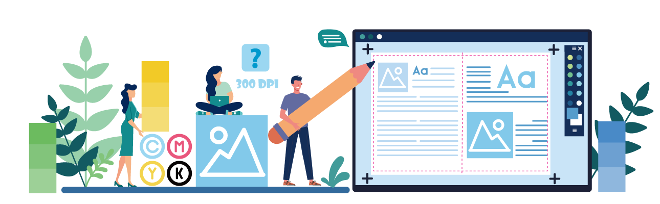
Prepress Topics You Should Know
To help you get started, here are the most important topics related to prepress artwork. Click any topic to explore detailed instructions and examples:
A simple, no-fluff checklist covering the key specs: file formats, bleed, resolution, color mode, and more.
Learn how to create bleed and trim zones so your content isn’t cut off during trimming. Crucial for full-bleed designs.
Why RGB doesn’t work for printing, and how to properly convert your files to CMYK for color accuracy.
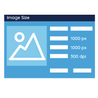
What does 300 ppi really mean? Discover how to make sure your images look crisp and clean—not blurry—on paper.
Understand the difference between vector and raster graphics, and when to use each. Especially important for logos and packaging.
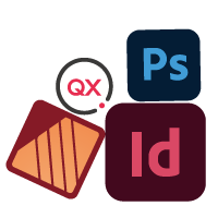
Walk through the pros and cons of the best software to prepare your artwork and layouts for offset printing.
Video Tutorials: Step-by-Step File Setup
Step-by-step video guides to help you prepare print-ready files for every need
Whether you’re working on a standard book layout or setting up advanced finishes like foil stamping or die-cutting, these video tutorials walk you through the essential steps using Adobe InDesign, Illustrator, or Photoshop. Perfect for beginners and experienced designers alike.
What Is Prepress Artwork and Why Does it Matter?
“Prepress” is the industry term for everything you do to prepare your artwork and layouts to deliver files that are ready for offset printing. It’s vital to follow the printer’s guidelines and get all the specifications right so that your products print perfectly. So, for example, you’ll need to make sure that your files are prepared and exported in the correct format, that your images have a high enough resolution, you’ve set up the appropriate color space, everything is properly sized, and more.
At QinPrinting, we take great pride in our superb customer service and our close attention to detail. We want every customer to get the exact results they hoped for, or better. So, our team of experts will always manually check all your files for you before we go to print. If we find any errors or other issues, we’ll let you know immediately, explain what the problems are, and help you fix them. But to make things even easier from the outset, we’ve put together this guide to what you need to know to complete your prepress work as smoothly and successfully as possible, to get a perfect print every time.
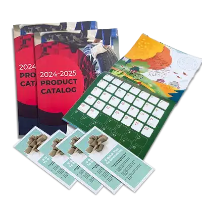
 Custom Card Decks
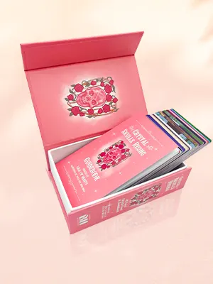
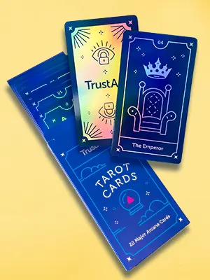 Custom Holographic Cards
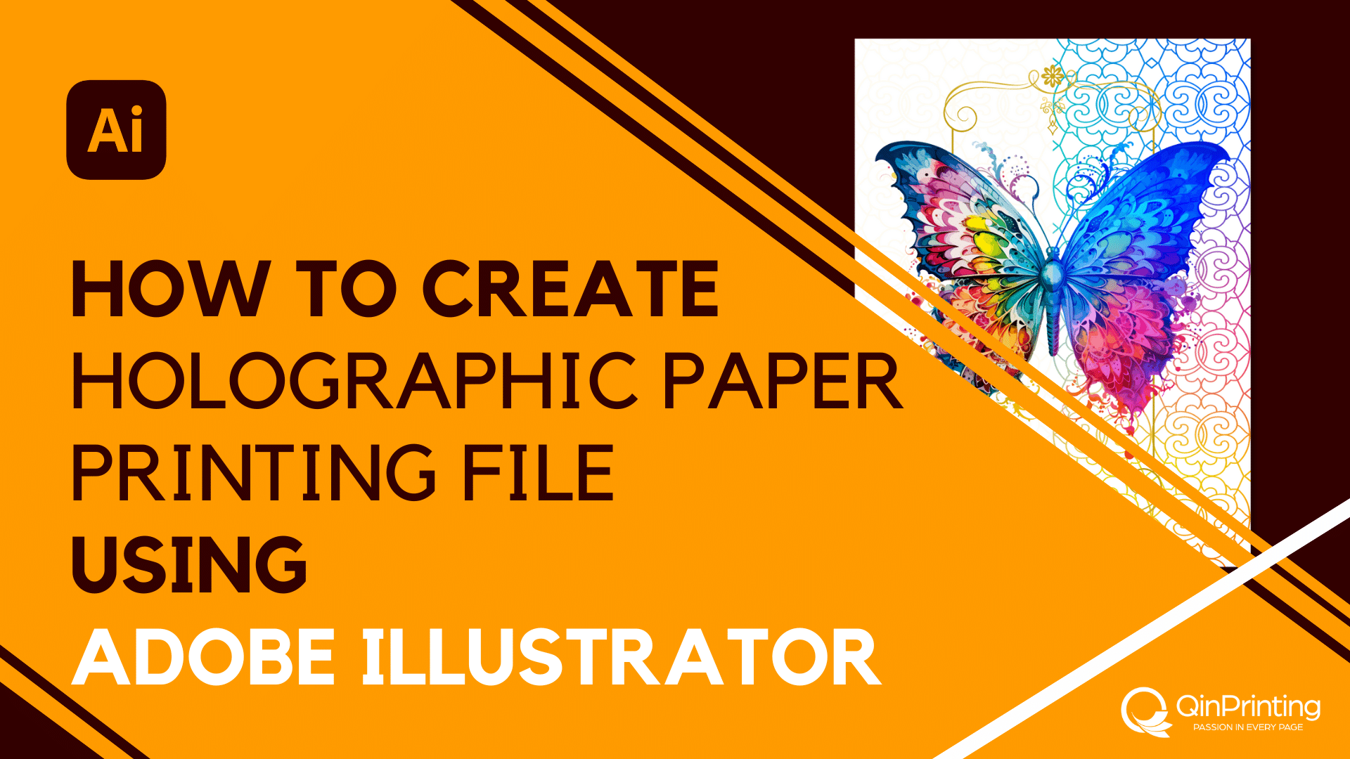
 Folding Cartons
 Rigid Boxes
 Corrugated Boxes
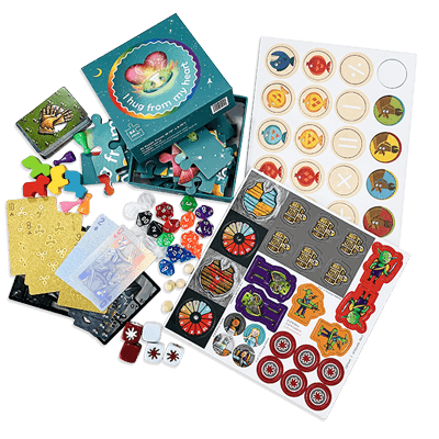
 Custom Board Game
 Kickstarter Print Solutions