 Custom Card Decks
 Custom Holographic Cards
 Folding Cartons
 Rigid Boxes
 Corrugated Boxes
 Custom Board Game
 Kickstarter Print Solutions
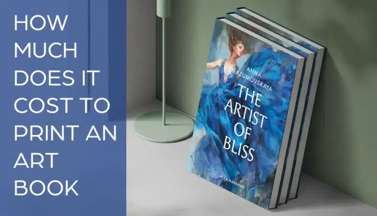
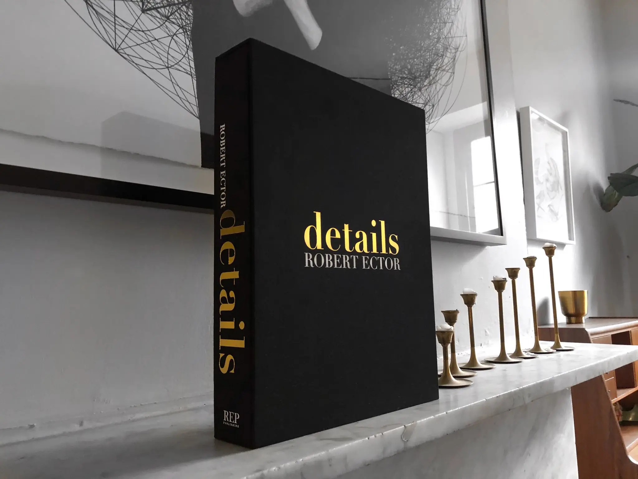
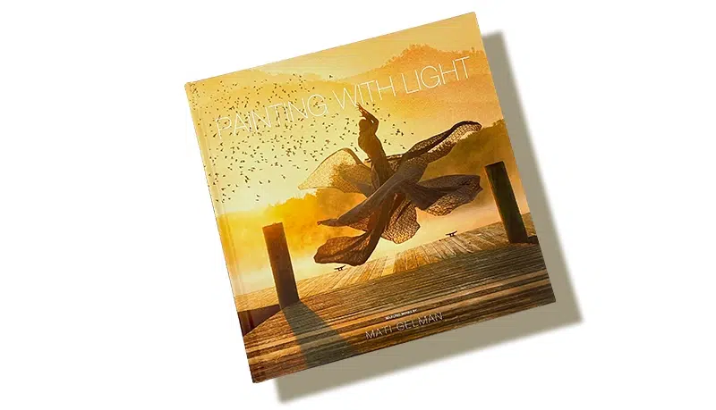
Whether you're an artist looking to promote your own work, a gallery curator, an independent publisher, or a critic, designing and printing a custom art book can help build your reputation, increase your visibility, and lead to more sales.
Embarking on the journey to design and print an art book that seamlessly blends high-quality, full-color or black-and-white photographic reproductions with insightful explanatory texts is a rewarding yet intricate task. Drawing on almost 30 years of success in the offset printing industry, during which we’ve helped design and print outstanding art books for large publishers and independent creatives alike, this post should serve as a detailed roadmap for book designers, providing insights into crucial technical and design aspects. From understanding the artist’s vision to final proofing, each step is carefully outlined to make sure that you create a visually stunning and intellectually engaging art book that will appeal to readers.
Understanding the artist's vision
Starting the design process begins with an in-depth understanding of the artist’s intent. Engaging in meaningful discussions with the artist if they are still living, or doing sufficient research if they’re deceased, is essential to grasp what makes their work unique and so draw out the unique selling point of your art book. Examine thematic nuances, conceptual foundations, and the emotional impact they aim to convey. This dialogue and research serves as the basis for design decisions, making sure that the layout and visual elements align seamlessly with the artist’s intended message, your aims as a designer, and the publisher’s needs and expectations.
Color management for an art book
Using a consistent color profile suitable for faithful high-quality reproduction using offset lithographic printing is paramount to preserving the wide color gamut inherent in the original artwork. So, as a minimum, work with the CMYK color space for simpler works and adopt the Pantone system for more textured and color-complex images. Throughout the design process, regular proofing on calibrated monitors and printers is essential for identifying and rectifying any discrepancies in color reproduction. Besides digital proofing, requesting physical color proofs from us, which we offer as part of our service, provides a tangible preview of how colors will translate in the final product, allowing for adjustments as needed and giving you confidence in the finished product before we go into mass production.


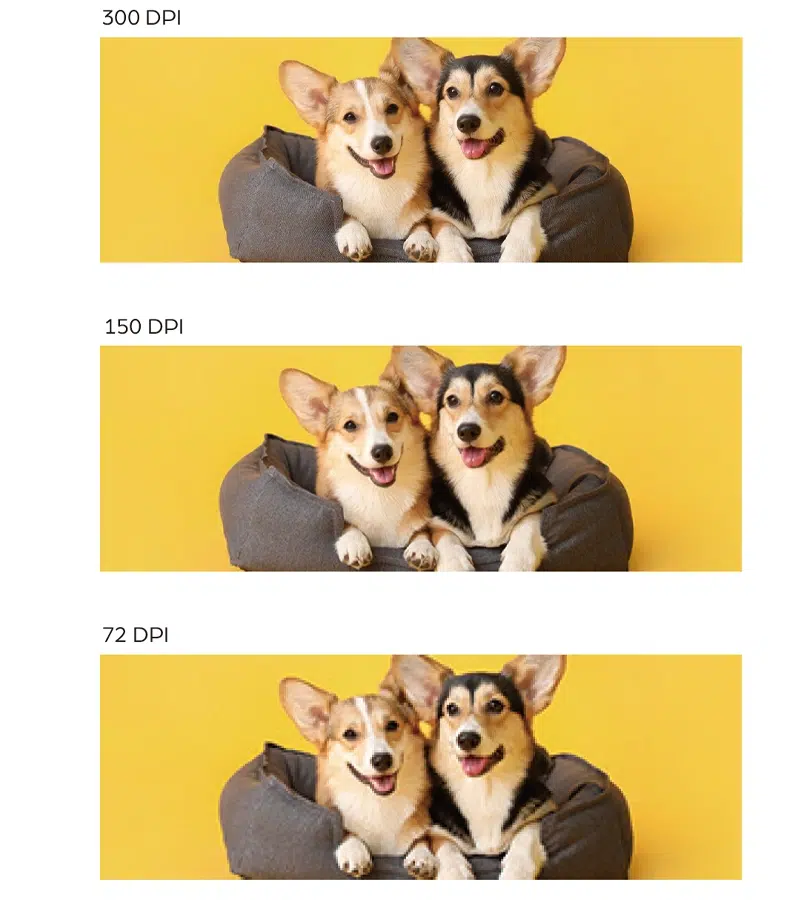
Resolution and image quality
The quality of photographic reproductions depends on the use of high-resolution images, ideally at 300 dpi or higher. This makes sure that you preserve intricate details and guarantees sharp, clear reproductions even when an image is rescaled to fit the layout or page dimensions. To prevent any loss of quality during the design process, images should be saved in lossless formats like TIFF. Checking for image integrity regularly throughout the design phase helps to catch and rectify any potential degradation early on.
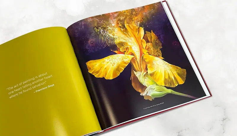
Layout composition
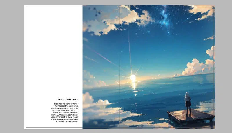
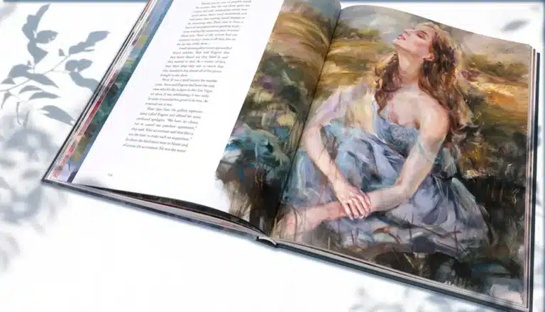
Implementing a grid system is foundational for maintaining consistency and alignment in the layout, particularly crucial for art books with complex visual elements. White space, strategically used, enhances the visual impact of both artwork and text, offering a balance that encourages readability and aesthetics. Experimenting with different grid configurations and white space variations will help you find the most visually appealing and cohesive layout. While varying page layout can enhance interest and boost engagement and reader attention, consistency also helps to avoid confusion and losing a sense of artistic unity and cohesiveness.
Typography
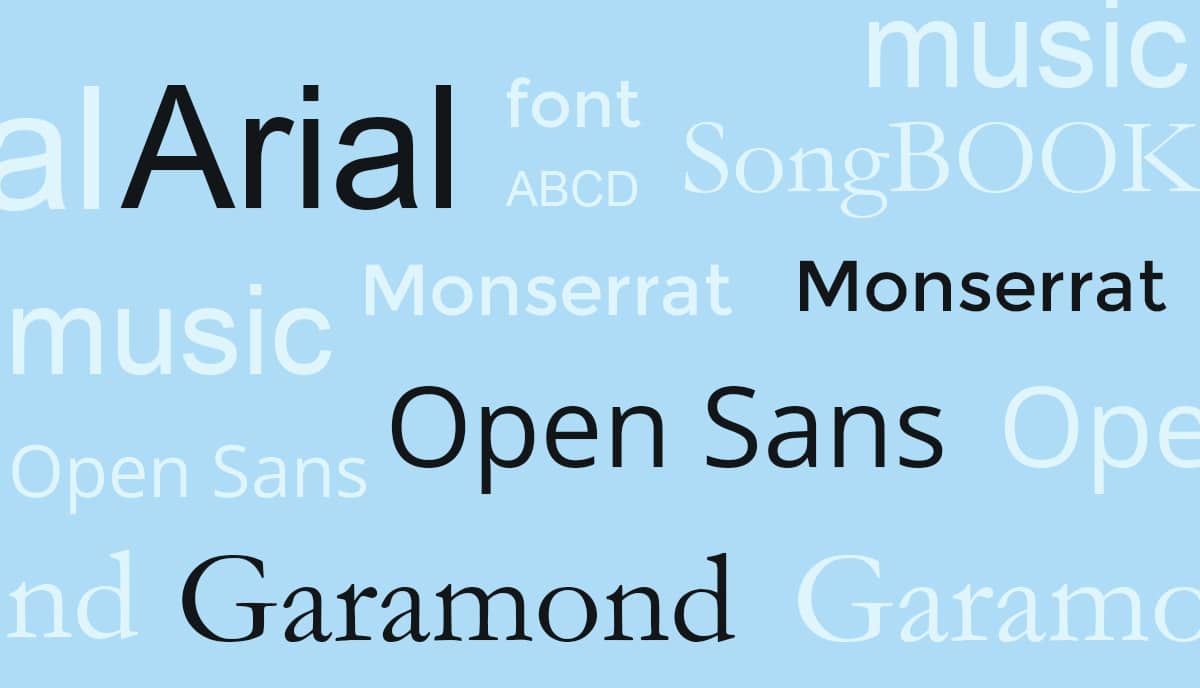
Font selection is another absolutely critical aspect, demanding careful consideration of readability and aesthetic alignment with the artist’s work, the overall layout, and the narrative flow of the written content. Whether opting for serif or sans-serif fonts, the goal is to choose typefaces that convey the tone and are easy to read. Font size and leading must be optimized for legibility, with variations used strategically to emphasize different sections or importance levels or informational hierarchy within the text. But don’t overdo it. Three fonts is usually an efficient maximum.
Captions and descriptions
Writing concise yet informative descriptions for each piece of work reproduced is a delicate art in itself. If you’re a third-party designer, then this text will be written by the author or a copywriter. But if you’re an independent creative or artist working on your own custom publication, you may want to handle the writing yourself. The language you choose should enhance the reader’s understanding of the artwork without overshadowing it. Consistency in formatting captions and descriptions, including font style, size, and placement, is essential to create a cohesive look and a comprehensible text. Experimenting with different caption styles, such as incorporating italics or varying font weights, can contribute to the overall success of the book.
Interactive elements
Incorporating interactive paper elements like foldouts or inserts adds a tactile dimension to any art book while enhancing engagement and arousing curiosity. Multiple-fold pages can allow readers to fully appreciate the scale of certain works, such as landscapes, cityscapes, and wide group perspectives, creating a more immersive experience and a stronger appreciation of the work. Exploring options like UV spot varnish or embossing for specific elements enhances the sensory engagement, contributing to the overall aesthetic appeal and the perceived value of the book itself. We always say it’s never too soon to talk to us about your project. We’ll be delighted to offer suggestions and options you may not have thought of or even realized were possible and to discuss the feasibility and execution of such interactive enhancements.
Page sequencing and flow
Creating a logical sequence for content organization helps guarantee that your art book becomes a cohesive visual and narrative journey for the reader. Considering the artist’s biographical or thematic progression, for example, guides the placement of each piece, contributing to the overall impact. Visual transitions between sections or chapters, achieved through consistent color palettes or thematic elements, create a smooth flow and enhance the immersive experience for the reader.
Print specifications
Collaborating with us to select the right paper stock is a pivotal decision in the design process. Factors like texture, weight, and finish must fit well with the artistic content to enhance the overall aesthetic, give the desired results in reproduction, and stay within your budget. Sampling physical examples of paper options and binding techniques helps in making informed decisions about how these elements will contribute to the final look and feel of the art book. We’ll gladly send you our paper and finishing sample book just for the cost of mailing it. For more detailed insights and instructions on choosing paper, dimensions, bindings, and finishes for an art book, see our core technical and informational page, Custom Art Book Printing.
Proofing and quality control
Requesting physical print proofs is a vital step to assess color accuracy and overall print quality. This makes sure that any issues, whether related to color, layout, or image reproduction, are identified and addressed before the final print run. Meticulous last checks for typos, layout inconsistencies, and any artifacts in image reproduction contribute to a polished final product. Involving an additional set of eyes for a final review helps catch any overlooked details and ensures a flawless presentation. Here at QinPrinting we offer a complete range of digital and physical proofs and samples to suit your needs and our technical design experts manually check every file before we go to print.
Talk to us!
Designing an art book that seamlessly integrates visual and textual elements demands meticulous attention to detail and a profound appreciation for the artist’s vision and the publisher’s needs. By following the information and guidance in this post and prioritizing color management, high-resolution images, thoughtful layout composition, and collaboration with QinPrinting’s design and printing professionals, you can embark on a journey to create a masterpiece that not only showcases your or another artist’s work but also provides a captivating and immersive reading experience for art enthusiasts which they’ll treasure for a lifetime.
Before you get started on your custom art book printing project, let’s have an informal, no obligation chat about how we can help you realize your dream of a truly beautiful edition. We can give you a quote upfront, too, so you know from the first what’s involved. There’s no harm in talking to us. Get in touch today.