Color is a powerful psychological and emotional messenger and it can influence how customers feel about your brand before they even read a word printed on the box. In packaging design, color choices are about more than just looking good. They’re about setting the right tone, making sure your product stands out, and even nudging buying decisions. At QinPrinting, we help businesses not just pick colors that suit their brand, but print them with accuracy and consistency across every box, every time.
Quick guide: how color affects perception
| Color | Common Associations | Packaging Use |
|---|---|---|
| Red | Energy, excitement, urgency, appetite | Food, drink, promotions |
| Blue | Trust, calm, professionalism | Health, tech, finance |
| Green | Nature, health, freshness | Organic products, eco-friendly packaging |
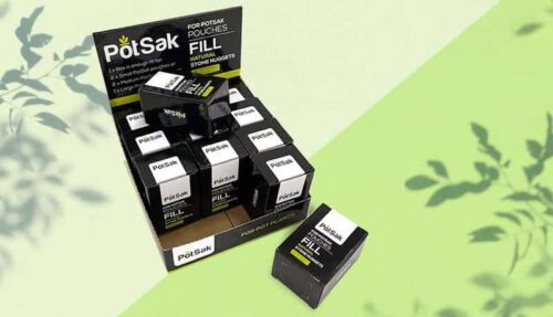
| Black | Luxury, sophistication, exclusivity | High-end goods, cosmetics |
| White | Simplicity, purity, cleanliness | Health, personal care, minimalist brands |
| Yellow | Optimism, warmth, attention | Children's products, affordable goods |
| Purple | Creativity, quality, mystery | Beauty products, luxury brands |
Colors influence not only individual perceptions but also how your product is categorized in the market. A red package might create urgency, perfect for limited-time offers or impulse buys, while blue tones can lend an air of reliability that suits medical or tech products. Think of the shelves in any store: color is the first signal a customer picks up on, long before reading the label.
Why color matters in packaging
When customers walk down a store aisle or scroll through online listings, they make split-second judgments. Color is a shortcut for emotions, values, and expectations. The right shade can draw attention, signal quality, or communicate a brand’s personality. But it’s not just about picking a color that “feels right.”
Studies show that up to 90% of snap judgments made about products can be based on color alone. This makes the role of color in packaging not just aesthetic, but strategic. Brands that leverage color psychology well can create emotional connections, build recognition, and influence purchasing decisions at a subconscious level.
The material, finish, and printing method you use all affect how color looks on the final product. A rich navy on glossy coated board will feel different than the same navy on natural kraft. That’s why we help clients think through not just what colors to choose, but how those colors will behave in print. Let’s learn more about our printing methods and how they affect color outcomes.

Choosing the right colors for your brand and product
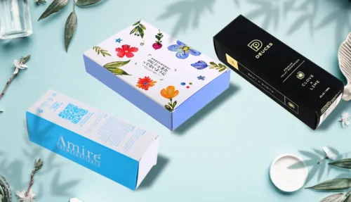
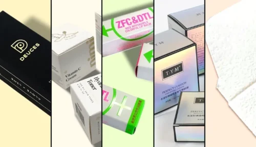
There’s no one-size-fits-all approach to color. Different industries, target customers, and product types call for different choices. Selecting the right colors is a blend of art, science, and understanding your customers.
- Know your customers: Colors can mean different things in different cultures. For example, white suggests purity in many Western countries, but in some parts of Asia, it’s associated with mourning. If you’re selling internationally, it pays to research local preferences.
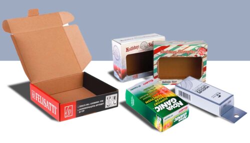
- Match the product category: Certain colors are more common in some product categories for a reason. Green and brown often suggest natural or organic products. Black and gold signal luxury. Bright primary colors catch the eye in toy packaging. Deviating from these norms can help you stand out, but you should do so with purpose.
- Stay consistent: Your packaging needs to match the rest of your brand. If your website, ads, and store signage all use certain colors, your boxes should follow suit. We use the Pantone Matching System (PMS) to make sure your colors are printed the same, every time.
- Think about shelf impact: On a crowded shelf, your packaging needs to pop. Sometimes that means choosing a color that contrasts with competitors rather than blending in. For example, if most organic products are in muted greens and browns, a clean, bright white might help your product get noticed.
Colors can also be used strategically to create a sense of hierarchy on the packaging—using bold colors to highlight key messages or call-to-actions, while using softer tones in the background.
Printing color accurately
It’s one thing to pick a color on screen. It’s another to get it right on paper or cardboard. Printing introduces its own challenges, but understanding these can help ensure your vision becomes a reality.
- Pantone vs. CMYK: Pantone colors are pre-mixed inks, great for precision. CMYK (cyan, magenta, yellow, black) is used for full-color printing but can vary slightly from screen to print. Pantone is often better for brand-critical colors where exact matching is essential, while CMYK is ideal for images or complex color blends. We help you choose the best option for your needs.
- Material affects color: Coated paper reflects light differently than uncoated. A matte finish will mute colors, while gloss makes them more vibrant. Kraft board gives colors an earthy tone. Even recycled paper stocks can subtly alter how a color appears. We offer a range of materials and finishes to suit your style.
- Lighting matters: Colors can look different under store lighting, natural daylight, or in photos. We test color proofs to make sure they’ll look right wherever they’re seen. Consider how your packaging will be displayed and in what kind of environment.
- Color consistency across batches: We maintain strict quality checks to ensure your brand colors stay consistent, even across large or repeated orders. Slight deviations in ink mixing or paper stock can affect consistency, which is why we document and follow precise color standards for every client.
Our goal is to make sure the color you imagine is the color your customers see—every time.
FAQ: Color and Packaging
1. Can you help me choose colors for my packaging?
Yes, we can advise on color choices based on your product, market, and brand style.
2. What's the difference between Pantone and CMYK?
Pantone is for exact color matching with solid inks; CMYK blends colors during printing and may vary slightly.
3. Will my colors look the same on kraft board as on white paper?
No, kraft board changes how colors appear. We can show you samples to help you decide.
4. Do you provide color proofs before printing?
Yes, we can provide digital or physical proofs so you can check colors before full production.
5. Can I use metallic or fluorescent colors?
Yes, we offer special inks including metallic and fluorescent options.
6. How do I make sure my packaging stands out on the shelf?
Consider using contrasting colors, bold design, or special finishes like foil stamping or spot UV.
7. What if I need to match existing branding exactly?
Provide your Pantone codes, and we’ll ensure precise matching using PMS inks.
Talk to us. We're here to help!
Color is one of the most powerful tools in packaging design. It grabs attention, tells a story, and helps customers connect with your brand. But choosing the right color is only part of the job—getting it printed accurately and consistently is where we come in. At QinPrinting, we combine technical know-how with a deep understanding of design to help you create packaging that looks just as good in real life as it does in your imagination. Ready to get started? Let’s talk. Get in touch today for a no-obligation quote or just to chat through your ideas with one of our friendly, expert team members. Shoot us an email at [email protected] or call us at +1 530 238 5010, and we’ll be delighted to discuss your needs. We look forward to helping you get the best deal possible both in terms of pricing and product quality.