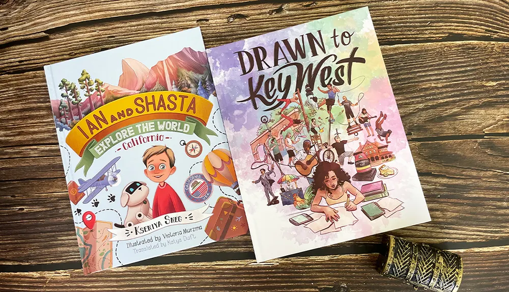
 Custom Card Decks
 Custom Holographic Cards
 Folding Cartons
 Rigid Boxes
 Corrugated Boxes
 Custom Board Game
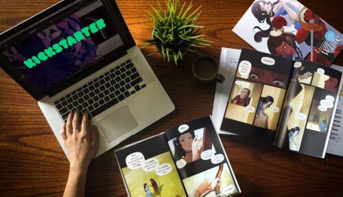
 Kickstarter Print Solutions
Good book designs don't just happen. They're the product of careful planning, which combines market knowledge, artistic creativity, and psychology. Here, we examine the psychology behind successful book covers
When it comes to books, we often hear the saying, “Don’t judge a book by its cover.” However, in reality, book covers play a significant role in attracting readers and influencing their decision to pick up a book. So in this post, we’ll explore the psychology behind successful book cover design. We’ll examine the importance of space, how and why to avoid clutter, the most powerful ways to use color, and other key factors that make book covers visually appealing, emotionally impactful, and intriguing enough for potential readers to pick them up and read the first pages or click on the “Look Inside” button on an online platform. Drawing on over 25 years of experience in helping mainstream publishers and self-published authors alike to print beautiful editions of their books and a little research into the principles of color, form, text, and proportion, let’s dive in and uncover the secrets of the psychology of book cover design.
The power of space
One vital psychological element of book cover design is the way you use space. By utilizing space wisely, you can draw the potential reader’s attention to specific elements on the cover and create a visually pleasing composition which not only communicates the essential factors such as the genre and style of your story or non-fiction book but that engages that potential reader’s emotions positively. Ample space allows the imagery and text to breathe, emphasizing the focal points and guiding the reader’s eye. Whether it’s a nonfiction book cover or a work of fiction or poetry, the strategic use of space can make a significant difference to the way a person perceives the cover and responds to it both with their thoughts and with their feelings.
For example, consider the book cover for “The Promise of Psychedelics” by Dr. Peter Silverstone.

The cover design incorporates generous white space that allows the title and author’s name to stand out clearly. The minimalistic approach creates an air of simplicity and clarity, reflecting the subject of the book. Likewise, the use of the walnut images as analogies for the brain intrigues the eye and also suggests a connection between mental health and naturally derived substances. The lack of confusion on the cover also gives the reader’s eye plenty of time to see and absorb the message on the badge in the upper left corner; namely, that the book is a Wall Street Journal bestseller.
Similarly, the cover of “The Love Island Bookshop” by Kate Frost uses space effectively.

In this cover, there’s no “white space” but the designer arranged the images to frame a clear blue sky in which the title and the author’s name a prominent. This space-framing technique allows the reader to grasp the significance of the imagery—exotic romance in faraway places—while focusing directly on the title and the name of the writer. Very smart!
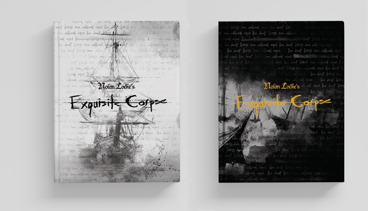
In contrast, the cover of “Hate Mail” by Michelle Robertson takes a more extreme perspective on space.

This is an extraordinarily minimalist design which maxes out on space and defies all the usual “rules” of cover design. It even dispenses with color. But the psychology of this book cover design is powerful and effective. It works on several levels.
- First, it doesn’t look like a book cover: it looks more like an email alert or a message notification on an otherwise blank screen—which is exactly what the cover needs to convey
- Second, against all the standard principles of cover design, it’s hard to read; it’s all space. But the arrangement of the letters and the use of the “open message” envelope-and-arrow symbol cause intrigue and suggest we need to look closer, to “open” the cover
- Third, where you would normally expect the core content, such as the title and the author’s name, there’s nothing, which attracts curiosity and causes the reader to look closer
They’ve placed the title in a way that requires the reader to zoom in and explore the cover more closely. This use of space creates intrigue and adds an element of mystery to the book.
Avoiding clutter
Most professional designers agree that clutter is the enemy of effective book cover design. Psychologically, we look for the central focus of whatever we see; we look for a clue to the “meaning”. When there are too many elements fighting for attention, the cover lacks a clear focal point, and the overall impact is diminished as the viewer’s eyes flick this way and that without finding a clear spot on which to rest. If the viewer’s brain can’t discover a meaning in the cover within a few seconds, they will feel confused and look away to something else. However, skilled designers can strategically use clutter to their advantage, as long as it serves a purpose and is visually organized.
So, what do we mean by “strategic clutter”? A prime example of strategic clutter can be seen in the cover of “Truth Like Oil” by Connie Biewald.
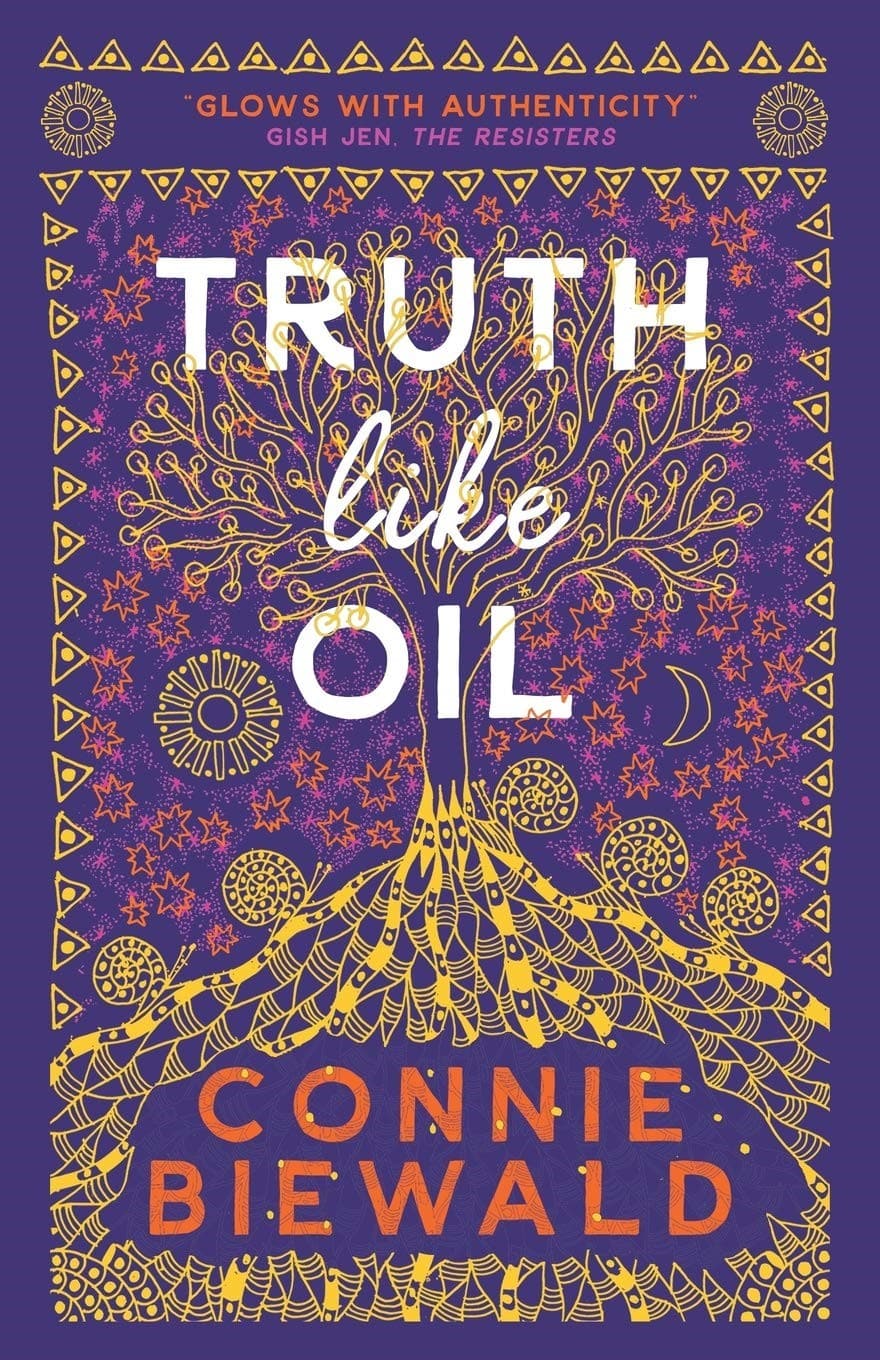
While the cover incorporates many elements, including text and illustrations, and could certainly be considered “cluttered”, the use of contrasting colors and careful arrangement ensures that the cover remains readable and understandable. The various colors and arrangement in a pattern-like structure help differentiate between the elements, preventing the clutter from overwhelming the design.
On the other hand, it’s essential to avoid cramming all the story elements onto the cover, as seen in the cover of “Moira: The Divided Worlds” by Lawrence Ambrose.

This overcrowded design lacks a clear focal point and can be confusing for potential readers. The colors are mismatched and the use of multiple fonts creates a clashing effect. It’s hard to understand what the genre might be, whether it’s intended for teenagers or adult readers, and even what the title is. It’s crucial to balance incorporating relevant elements and maintaining a visually appealing and organized composition. We don’t know, but we suspect that this cover was not professionally designed but spliced by the author. We should add that we’ve read none of this author’s books and that, despite the covers, they have “found a niche” with several excellent reviews about the stories. So, while we personally don’t like the covers, we have no comments—positive or negative—about the content.
The impact of color
From a psychological perspective, color plays a vital role in book cover design, as it can evoke emotions and create associations in the reader’s mind. When used effectively, color can separate elements on the cover, draw attention to specific areas, and convey the tone or genre of the book.
To avoid overwhelming the reader’s eye, we recommend limiting the number of colors used on a book cover. A simple color scheme with a maximum of three dominant colors and two accent colors is often effective in creating a visually pleasing and cohesive design. Although, often, one or two primary colors and a single accent color works best.
For example, the cover of “Leaving the Safe Harbor” by Tanya Hackney—which has won multiple awards—employs a limited color palette of blues and greens.

These colors evoke a sense of the sea and are emotionally calm and reflective, expressing the book’s themes and creating a harmonious visual experience for potential readers. The award medal is a metallic embossed foil stamp but is discreetly and artfully placed.
In contrast, “Postcards from Beyond Reality: The Selected Poems of Michael Daniels” by Bernard Jan uses a bold and contrasty color combination of orange, black, and white. This color scheme not only grabs attention but also conveys a sense of confidence and intensity, perfectly suited to the book’s genre. This is a literary metafiction (it’s a collection of poems written by a fictional character from one of the author’s other books) and the cover design is beautifully done both to reflect the content and appeal to the intended reader.

Different colors have different psychological associations. Purple and turquoise can create a feeling of calm, while blues and greens paired with yellows, oranges, or reds can evoke confidence and reliability. Understanding the symbolism and emotions associated with colors can guide designers in creating impactful and meaningful book covers.
Typography and fonts
Another vital aspect of book cover design is typography and font selection. The right choice of fonts can enhance the overall aesthetic and convey the tone of the book. It’s important to select fonts that are legible, visually appealing, and align with the book’s genre or content. And we strongly recommend that you use plain fonts, ideally just one or a maximum of two. Anything else looks too “busy” and confusing. And it certainly screams “amateur self-published author” which many readers find off-putting. The content may be wonderful, but if the reader doesn’t get past the cover, they’ll never know.
For example, a horror novel may benefit from bold, gothic-style fonts that evoke a sense of mystery and darkness. A romance novel might call for more elegant and flowing fonts that convey a sense of romance and beauty. Likewise, a business guide could use a clear document-style font and a science fiction saga might favor “computer writing”.
Whatever your genre and choice of fonts, it’s essential to balance creativity and readability when designing a book cover. This works on two psychological levels. In the first, you want the font to connect emotionally with the reader’s expectations of the genre (hence a flowing pink font for the romance and a steely hard-edged font for a thriller). But the second level is that most people don’t want to work hard to get the information they want and so the font must be instantly and easily legible. Experimenting with different font styles, sizes, and layouts can help find the perfect combination that captures the essence of the book while ensuring the text remains clear and easy to read.
Visual imagery and illustrations
The imagery and illustrations used on a book cover can provide a glimpse into the book’s content and capture the reader’s attention. Whether it’s a photograph, an illustration, or an abstract image, the visual elements should be carefully chosen to represent the essence of the book. You don’t always need an illustrative image at all. Many successful book covers convey everything they need through color and typeface or with a simple abstract design.
In nonfiction books, the cover image should align with the subject and convey the book’s principal theme or idea. For example, a book about nature might feature a stunning landscape photograph, while a book on psychology might incorporate symbolic illustrations related to the mind or emotions, rather like the walnut symbolizing the brain in the first book we looked at in this post.
In fiction and poetry, the cover image can be more open to interpretation. It should reflect the genre, tone, or central themes of the book, intriguing potential readers and sparking their curiosity. Whether it’s a mysterious silhouette, an evocative scene, or an abstract representation, the imagery should create an emotional connection and entice readers to explore further.
Genre-specific considerations
While, as we’ve seen with the cover for “Hate Mail”, rules are there to be broken. However, reflect before you break the boundaries of convention and current trends. Different genres have their own conventions and expectations for book cover design. Understanding these genre-specific considerations can help you create covers that appeal to your target readership and accurately represent the book’s content so that a potential reader can quickly identify the book as a good fit for their tastes.
For example, romance novels often feature vibrant and warm colors, depicting passionate embraces or intimate moments. Mystery and thriller novels often use dark and moody color palettes, with a focus on suspenseful imagery such as shadows, crime scenes, or mysterious symbols. Science fiction and fantasy novels often showcase imaginative landscapes, futuristic elements, or magical symbols. You get the idea.
It’s important to research and analyze successful book covers within the specific genre in which you write to understand the visual language that successful designers have used and the viability of given trends. By incorporating genre-specific elements while adding a unique twist, you stand the best chance of creating a book cover that stands out and resonates with your intended readership. Getting behind the psychology of how readers recognize, interpret, and choose books based on the cover design is an essential aspect of the art and science of successful self-publishing.
Branding and series design
It’s common knowledge now that for self-published authors especially, success rarely comes with only one book. Series are the best way to go to make a living as a self-published author as you build a fanbase and an email list of readers who can’t wait for the next installment of an ongoing story arc with characters they love. For authors with multiple books or series, establishing a consistent brand identity through book cover design is essential. Creating a cohesive visual style across all books in your series helps readers recognize you as the author and develop a sense of familiarity and trust. Psychologically, this level of recognition means that the potential reader is far more likely to buy the new book because the recognition response will release happy emotions associated with reading the previous book, which they loved. Those emotions are instantly associated with the new book even before they’ve read it.
Consistency can be achieved through the use of the same typography, color schemes, or visual motifs. This branding approach allows readers to identify books by their favorite authors, even from a distance or when browsing online. And it’s not just self-published authors who benefit from this psychology. Mainstream publishing houses use it all the time.
For example, Bill Bryson’s books exhibit a consistent visual style, thanks to collaborations with illustrators such as David Cook and Neil Gower. Using the same typography, layout, and muted pastel palettes creates a sense of unity and recognition among Bryson’s books. This consistency appeals to readers who enjoy collecting and displaying books with a cohesive aesthetic.
So, the psychology behind compelling book cover design is a fascinating blend of visual aesthetics, emotional appeal, and genre-specific considerations. By understanding the importance of space, avoiding clutter, using color effectively, and incorporating appropriate typography and imagery, you can create book covers that engage readers and entice them to explore the content within.
Book cover design is a creative and ever-evolving field, where experimentation and innovation play a crucial role. By staying informed about current trends and taking risks while maintaining a sense of coherence and brand identity, you can create visually stunning covers that captivate readers and contribute to the overall success of a book. So, if you’re an author seeking to make a memorable impression, remember the power of a well-designed book cover and the psychology behind it.
Talk to us!
At QinPrinting, we’ve enjoyed over 25 years of success in the offset printing industry and helped thousands of self-published writers and independent creatives just like you to create beautiful and successful print editions of their books. If we can help you realize your self-publishing dreams, we will. We always say that it’s never too soon to talk to your printer.
We have a huge amount of experience and expertise which we can put at your disposal. And we’ve made it super-easy to get in touch with us, either by telephone, email, the live chat, Skype, or the online contact form. We look forward to hearing from you and seeing all your hard work finally wrapped in a beautiful, professional book cover design.