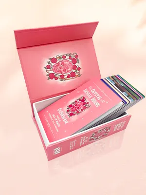
 Custom Card Decks
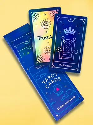 Custom Holographic Cards
 Folding Cartons
 Rigid Boxes
 Corrugated Boxes
 Custom Board Game
 Kickstarter Print Solutions
We explore the five essential elements of successful comic books and how you can use them to make yours stand out
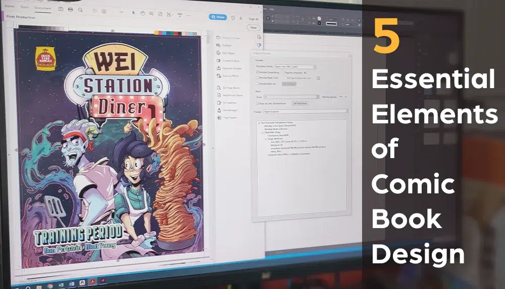
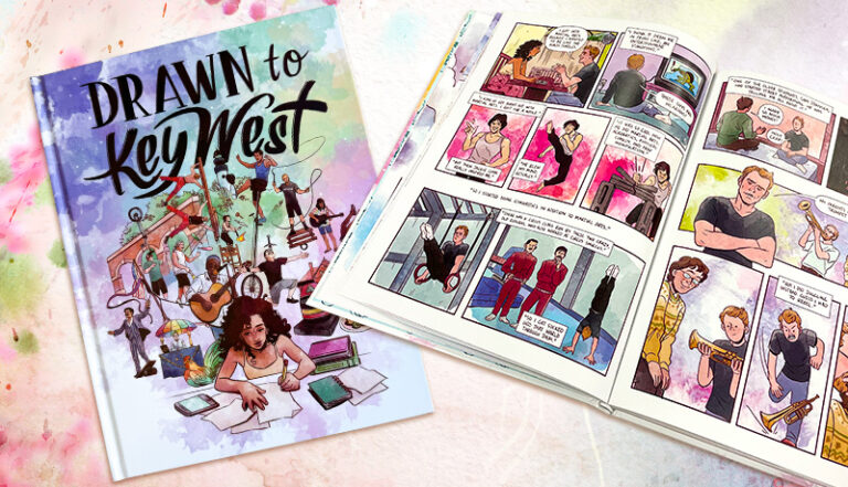
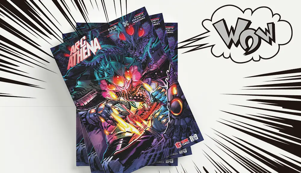
Comics Printed by QinPrinting
Who doesn’t love a superhero comic? Whether you prefer Marvel or D.C., to fly above New York with your scarlet cape flapping in the wind and an outstretched fist or to swing across the Manhattan skyline from a spiderweb thread, most people associate comic books with hyperreal heroic adventure stories. But comics can be so much more than that, too.
They range from heart-warming Christmas fables like the late Raymond Briggs’s family favorite, “The Snowman” to dark tales of holocaust survival in Art Spiegelman’s “Maus”, or poetic coming-of-age fantasies as in Neil Gaiman’s “Coraline” and the laugh-out-loud comedy capers of Goscinny and Uderzo’s “Asterix the Gaul”.
If you want to make your own comic book, know this: it can be anything you want it to be. The only limit is your imagination. However, there are certain fundamentals you’ll need to understand; five essential elements of every successful comic book. These aren’t rigid rules to stifle your creativity; they’re the artistic factors which give you the possibilities you need to express your creativity fully; they’re what makes a comic book what it is. It’s how you use them that will make your comic book unique.
A quick summary:
In this post, we examine and explain the five fundamental components that make comic books engaging and unique:
- Spectrum of style – The artistic style significantly influences emotional tone and storytelling impact.
- Expressive text – Words visually integrate with images to enhance or alter meaning.
- Manipulating meaning – Combining text and visuals creatively to deepen storytelling and reader interpretation.
- Flexible timescapes – Unique control over narrative timing to innovate storytelling.
- Visual rhythm and tone – Layout decisions that influence pacing, emphasis, and emotional intensity.
Now, let’s look at each in more detail.
1. The spectrum of style
The simplest comics can be stylistically super-simple — nothing more than childlike stick figures against a white backdrop. The most complex graphic novels may boast artwork which expresses a technical skill, artistic vision, and attention to form, composition, and detail that would not look out-of-place hanging on the walls of a fine art gallery. So, there’s a spectrum of stylistic possibilities in the world of comic book creation which gives you enormous creative freedom.
You could, for example, choose a realistic, or hyper-realistic, or grotesque, comedic, naïve, caricatured, simplistic, even abstract and symbolic style. Your drawing style may be characterized by clear, bold lines, or detailed dotting and cross-hatching. But your comic book drawing style is always personal to you.
Still, your style isn’t only a matter of creating aesthetic effects. The same images drawn in diverse styles can leave dramatically different emotional impressions. Here’s an example of what we mean.
Imagine a violent scene in which, say, a sharpened arrow pierces one character’s head. You could draw that scene with detailed realism, showing the torn flesh, the splatter of blood, and the look of agony and fear on the character’s face. Using that style to show this scene would evoke a sense of horror in the reader. The caption or speech bubble might read only, “Arrghhh!”
Now imagine the identical situation but drawn in a comedic style — you can imagine Asterix, if you like — with the arrow going through some dumb Roman soldier’s head. You could show his knees knocking together, his eyes crossed and tongue sticking out, with him saying, “What a headache! I knew I shouldn’t have had that last cup of wine!” Done like that, the effect would be to raise a laugh, or at least a smile, to the reader’s lips.
The same situation — a character shot by an arrow — has a completely different emotional effect on the reader because of the drawing style you choose to embody the scene. That’s the power of style. It can alter the fundamental meaning and significance of a scene. Here’s another example.
Imagine a comic book panel showing a person sitting on a park bench. It doesn’t matter how you imagine their posture, their clothes, their hairstyle or anything else. Just as they come to your mind’s eye; a person sitting on a bench in the park. Now, changing nothing about their sex, clothes, appearance, posture, or location, imagine them drawn in two contrasting styles. In one, say, they’re shown in minimal pen strokes, crisp black lines with no shading and plenty of white space. In the other, the artist has scratched at the paper, scribbled shading, cross-hatched, drawn several lines for each form, and let ink splatter here and there.
Again, what you’ll find is the same image, but the two different styles evoke distinct emotional responses; they tell a different emotional story. Another example of the power of style. Another example of the potential emotional tone of a comic book.
So, think with great care about your style. Experiment with various approaches. But remember that you needn’t stick to one style throughout your book. While broad consistency will help give the work a sense of overall integrity and help the reader interpret the visual language in which you tell your story, switching out your style to achieve specific emotional effects is a good idea and a technique often used by the greatest comic book creators of the age. Style is mood, emotional tone, expressive cadence. And it’s the first essential element of any successful comic book design.
2. What's in a word?
While comic books are primarily visual media, they also use words and those words have a vital role to play. But how the textual component of a comic book works differs from a novel. In a novel, we print the words in a single, unhanging format and font throughout — with rare exceptions. They also communicate all the meaning, and any drawings are reduced to mere “illustrations”. In a comic book, the pictures tell the story and the words have either a supportive, interpretative role or serve as functional indicators to move time along or switch locations. “Two weeks later…” and “Meanwhile, on 54th Street…” for example. They also express dialogue and the inner thoughts of characters, usually in speech and thought bubbles, respectively.
The words in a comic are integral to the artwork and even share some of the same qualities. You may write them large and reshape them as with the flash-style “WHAM!” “POW!” and “ZOOM!” of the classic comic books, for example. Writing the text by hand or “bolding” certain words, or changing their font and style will change their meaning, impact, and emphasis. Embedding textual commentary into the “world” the artwork expresses, perhaps with words appearing on a poster in the background of a street scene, or on the pages of a newspaper a character is reading or has just set aside, or on a storefront, and so on are all ways that the text in comic books works differently than in a regular novel. Visually expressive text is the second powerful element that makes a comic book distinctive.
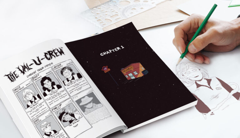
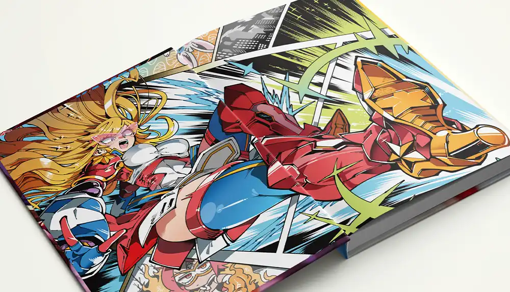
Comics Printed by QinPrinting
3. Manipulating meaning
In comic books, unlike in other narrative media, you can use these peculiar qualities of visual communication both in the artwork and the text — and the liminal spaces where they overlap — to manipulate the reader’s interpretation of a panel, scene, or image. You can manipulate meaning. The key to understanding this is to recognize that in a comic — unlike in a novel with its few, merely descriptive illustrations or none — the art and the text interact, complement, and contrast in powerful ways.
If the words in a comic only describe what the reader can already see, they are pointless and you must remove them. To use them meaningfully and to achieve a unique effect, add them only where necessary, where they communicate information that the images can’t, or when they can enrich insight into the story in a way that the artwork alone cannot achieve.
You can provoke the reader’s response by contrasting the image they see and the words they read in surprising juxtapositions that invite a specific interpretation, or leave them wondering at an ambiguity or dissonance with which you present them. For example, imagine a panel showing a person slumped at a bar, clearly worse for drink, an empty bottle of bourbon at their elbow, and looking thoroughly miserable, but with a caption that reads, “At the end of the night, Charlie and his friend Jack Daniels were ready to take on the world.” Charlie may feel ready to take on the world after spending the night with his “friend” but the reader can see that the reality is otherwise — he’s worthless and the whisky is not his friend. Contrasted like this, the text and image weave a richer tapestry of meaning.
You can also use the juxtaposition of text and image to create dramatic irony — when the author shares information with the reader of which the protagonist is not aware. Imagine your protagonist on a train, thinking that they’ve successfully completed their mission, and all there is to do now is head back home. The text shows their inner thoughts which are positive, based on the certainty that the bad guys are all dead, say, and planning what the protagonist will do on their vacation. But in the artwork, we see the bad guys — who have clearly survived whatever went before — pushing their way through the crowded carriage. In each frame, their ugly, grim forms, bent on revenge, get closer to the oblivious protagonist.
The possibilities presented by juxtaposing text and image to complement or contradict each other, to create contrast, ambiguity, and dramatic irony are unique to the comic book form and the third essential element of comic book design to master.
4. "Timescapes" and implications
When you first think of a comic book and the layout of the panels or frames, you probably imagine each panel following the other in a chronological sequence. What we see in the second frame happens after what we have seen in the first frame, and what we see in the third frame happens after what we see in the second and so on. But not always.
One joy of comic book creation is the facility with which you can bend “timescapes” to achieve specific narrative effects and to allow readers to work out a puzzle or infer the existence of events which are never shown.
You can run your story backwards, say, as the elderly care home resident remembers her glory days, or you can fuse dream sequences seamlessly into the current action; you can leap back and forth along the timeline, leaving the reader to fill in the gaps and piece the events together. Comic books are a perfect space for using the “montage” technique that you may have seen in the movies. For example, you might compose a montage sequence to show:
- several events happening at the same time in different places
- several events happening at different times in the same place
- several seemingly unrelated events
- a long event — typically a journey or a love-making scene, for example — retracted to a short period
- a series of events related by meaning or metaphor but not directly related to the dominant story
- flashback sequences
- dream sequences
- a range of possible future events imagined by a character
As you work on your comic book design and layout and play with ideas, you may find other ways to extend, contract, distort, and reorder your timescapes. But it’s important to use this technique only in the service of telling the story; never succumb to the temptation to introduce an effect just because it’s “clever”. The story must always come first. But the option to play with time and allow the reader to infer events which are implied but never seen is the fourth narrative possibility almost unique to the comic book.
5. Rhythm, accent, cadence, and tone
With a traditional text-based novel or short story, the rhythms, accents, cadences, and tonality of the words and phrases allow the author to suggest mood, tempo, and atmosphere. When a skilled actor reads a novel aloud — say, for an audio book recording — you hear how powerfully the “tone of voice” creates, affects, and changes the sense, atmosphere, and meaning of the words. You can achieve a similar effect in a comic book, but you do it through the layout of the artwork.
For example, let’s say that you establish the traditional left to right zig-zag-down-the-page reading order. You could change the rhythm by making one panel larger than the others, thus emphasizing it. You might choose to interrupt the six-panels-per-page format with a two-panel page or a single image which fills the entire page — a so-called “splash page”. Try changing the shape of one or more frames in a sequence and see how that alters the pace of the story or the emphasis on one action over another. Use more or less white space, remove the frames from panels, skew the angles, or place one panel inside another. All these ideas are the equivalent of the rhythm, cadence, accents, and tone when expressed visually rather than in text.
You will discover many more creative techniques to play with the pace and expressive possibilities of your comic book. It’s vital that your story doesn’t plod along to an unchanging rhythm like a monotonous metronome. The pace and even the “volume” must change to maintain the reader’s interest, to reflect the emotional quality of a scene, and to keep the pages turning. Using layout in this way is the fifth essential element of good comic book design.
Comics Printed by QinPrinting
These five elements are essential for creating a compelling comic, helping creators balance storytelling, pacing, and visual structure in a cohesive way.
When you are ready to turn your structured story and page planning into a professionally produced book, these decisions will directly influence your layout and formatting in manga printing, where page design and print specifications are aligned with industry standards.
Frequently Asked Questions (FAQs)
Do I need professional drawing skills to create a comic book?
No, comic styles range widely, from simplistic stick figures to highly detailed illustrations. Choose a style that matches your abilities and storytelling needs.
Can I mix multiple artistic styles within the same comic book?
Yes, blending styles can effectively create varied emotional tones or highlight specific narrative elements, though overall consistency helps readers follow the story.
How are words used differently in comics compared to novels?
In comics, words complement visuals by indicating dialogue, thoughts, timing cues, and scene transitions, often with expressive or visual fonts that integrate with the artwork.
What is "manipulating meaning" in comic design?
It’s the strategic combination of text and images to create contrast, dramatic irony, or layered meanings that influence reader perception and engagement.
What are "timescapes," and why are they important?
Timescapes involve creatively organizing narrative time, allowing events to be rearranged, condensed, or expanded, enhancing storytelling flexibility and reader involvement.
How can comic book layout affect storytelling?
Layout influences pacing, focus, and emotional impact, with tools like panel size, page structure, white space, and splash pages significantly affecting reader experience.
What should I avoid when designing my comic book layout?
Avoid overly complicated or distracting layouts that don’t serve the story—every creative choice should enhance readability and narrative clarity.
Talk to us. We can help!
As you may have guessed by now, at QinPrinting, we love comics and have thought about them a lot. As a world-class offset printer with over 25 years’ experience in the industry, we’ve helped more independent comic book creators bring their visions to life than we can count. When you’re ready to print your comic, let’s talk. Along with our experience and enthusiasm, we have all the latest printing technology in our plant in Shanghai — the global center of professional offset printing services — and an unmatched commitment to personalized customer care.
If you need any further help or advice on designing and printing your perfect comic books, we’re here to help you every step of the way from concept to completion. Contact us now for expert guidance and high-quality design and printing tailored to your specific needs. Just shoot us an email to [email protected] or call us on +1 951 866 3971 and we’ll be delighted to do all we can to help you. We can’t wait to see what you’ve been creating and help you share it with the world!