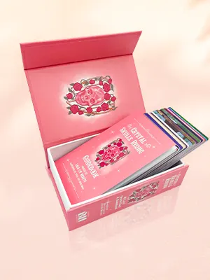
 Custom Card Decks
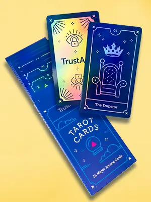 Custom Holographic Cards
 Folding Cartons
 Rigid Boxes
 Corrugated Boxes
 Custom Board Game
 Kickstarter Print Solutions
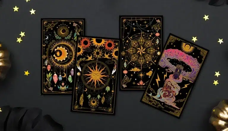
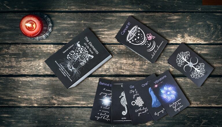
Do you want to design and print your own distinctive tarot card deck? We guide you through the fundamental elements of symbolism and composition to help you as you embark on this fascinating artistic journey.
The origins of tarot cards go back millennia, making for a fascinating look into the past. People’s imaginations have been sparked and insights into the human condition gained thanks to the mysterious cards decorated with exquisite and significant artwork. In this post, we will examine the fundamentals of tarot card art design, including the role of symbolism, the history of tarot card design, and the necessity of composition in producing aesthetically pleasing tarot decks.
The meaning behind tarot card symbols
The iconic artworks depicted on tarot cards are known for their profound symbolic value and their ability to provide a window into the human experience. A tarot card can stand in for an entire archetype, personality attribute, or even an entire life circumstance. These cards’ symbols serve as visual clues that lead the user into introspection and the realm of intuition.
Caitlin Matthews, a tarot historian, claims that the symbols depicted on tarot cards have changed over time in response to societal norms and the demands of tarot card readers. A wider audience might understand images in older tarot decks, but those in newer decks are often more abstract and difficult to relate to. To make a tarot deck that appeals to the widest potential audience, however, it is essential to balance complexity and readability.
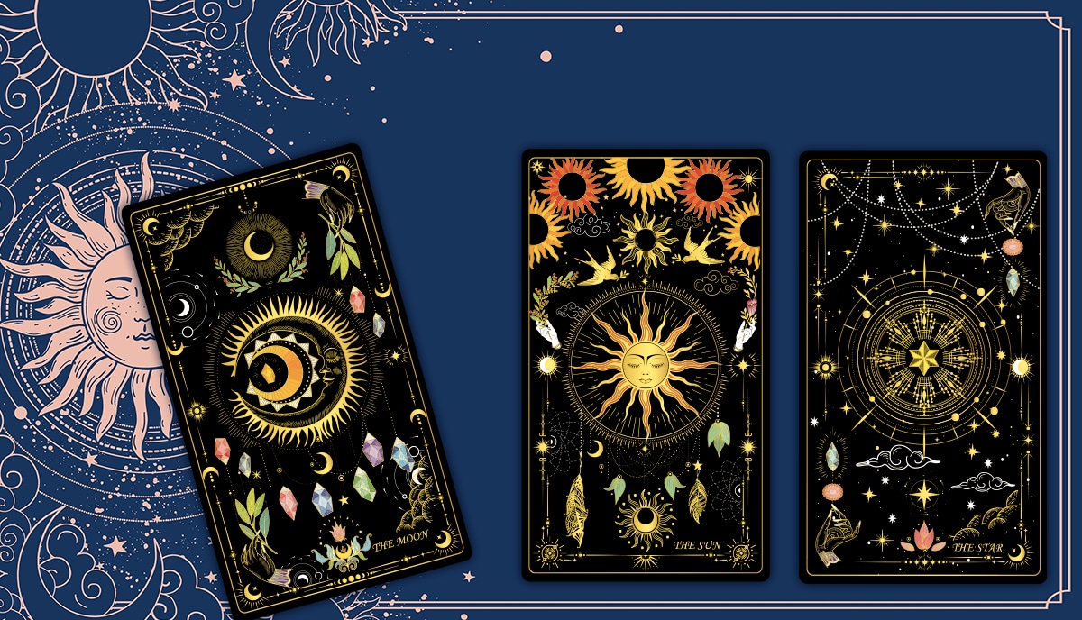
Artist John (Ohni) Lisle, best known for their reinvented versions of the female tarot cards, uses symbolism to great effect. Their striking depictions of classic tarot figures like The Star, The Magician, and The Fool show the enduring allure of tarot card art.
The development of tarot card artwork
Tarot cards have a mysterious past, making it hard to determine when they started being used for divination instead of just as a card game. Tarot cards can be traced back to the long European tradition of playing cards, which dates to at least the 1300s. However, historians and fans alike continue to argue over the actual beginnings and evolution of tarot card designs.
Protestant pastor Antoine Court de Gebelin of the 18th century thought the tarot cards possessed supernatural power and ancient Egyptian mysteries. His claims were unsupported by evidence, but they helped popularize tarot as a means of divination.
One of the most widely used tarot decks dates back to the 17th century, and it is called the Tarot de Marseille. Most of these decks were printed with woodblocks and then hand-colored with simple stencils. The Tarot de Marseille has stood the test of time because of the universal meanings of its symbols and its sumptuous and intricately colorful artwork — which was all originally done by hand, although you can find printed facsimiles on sale today.
Composition's importance in tarot card illustrations
The composition of a tarot card is crucial to its overall aesthetic value. The concept of composition refers to the arrangement, placement, and visual balance of the card’s pictorial elements within the frame. A well-composed tarot card does more than just show what it means; it also makes the viewer feel something. It works, through color and form, at an emotional as well as an intellectual level, to provide the user with a holistic insight into themselves and their life path.
Compositional techniques are used in the fine arts and illustration to guide the placement of diverse elements to achieve a balanced and aesthetically acceptable whole. Creators and audiences alike can benefit from a thorough understanding of compositional principles by actively engaging with works of art and delving into their multiple meanings. Before you design your own tarot card artwork, we strongly recommend examining as many of the decks — both traditional and contemporary — that you can. And take the time to look up the artist and explore their other work, too, to get a deeper sense of how they use composition.
Consistency throughout the design and a well-balanced composition are two of the most important aspects of tarot card painting other than the fundamental symbolism itself. The ability to develop a distinct “visual voice” while adhering to consistent compositional decisions separates apart outstanding tarot cards, whether they feature stick-figure cartoons or Renaissance masterpieces.
A guide to viewing tarot cards as art
For centuries, people have looked to tarot cards for insight into the future, self-awareness, and psychological insight. Given the emphasis often put on their role in divination and self-development, the creative worth and elegance of these cards are often overlooked, though. But tarot cards deserve to be appreciated as art if we know how to apply the rules of artful composition when creating them. In this next section, we’ll look at the tarot card design through the lens of compositional theory in a little more detail. This perspective will help you gain a greater appreciation for the visual qualities within each card, which will help you to design your own tarot.
Structure: an artist's backbone
As we’ve established, composition is the arrangement of visual elements within the frame and their relationship to one another in the fields of fine art and illustration. It’s the base from which we construct any visual work. In order to create interesting and aesthetically pleasing artwork for your tarot cards, your composition is essential since it dictates where the “stuff” is.
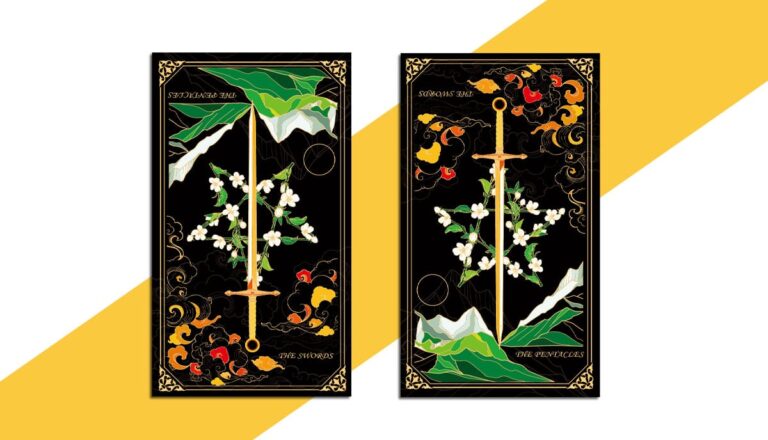
So, the arrangement of elements on the cards in a deck of tarot cards is crucial. The cards in a tarot deck are always the same size and shape — to enable easy handling during play or a reading — although the layout can vary depending on the designer. You can alter the size, general form, surface area, dimensions, aspect ratio, orientation, presentation, and frame. Several of the more traditional decks can seem gigantic compared to modern playing cards, for example, and a newer form of tarot known as an Oracle deck, often has round or other shaped cards. But the “rules” of composition don’t apply to these factors. The placement of images, symbols, shapes, and so on within the frame and relative to each other is what matters.
There’s a practical aspect to this, however, which doesn’t apply to art intended to be displayed only. Tarot cards are held, shuffled, and flipped, so it is important that their construction accommodates these uses. In addition, the symmetry or complexity of the card’s back design affects how we perceive the card’s orientation.
How a picture is framed
The placement of the focal image within the tarot card’s borders is the next step after the card’s surface and format have been defined. Making choices about the artwork’s internal border width and outline needs thought in terms of its artistic sense, printing requirement (“bleed”, for example, the amount by which the artwork goes beyond the finished frame), and potential cropping or magnification during digital design, are all part of this process.
Using both positive and negative space is crucial when framing an image. The area occupied by distinct content — an image, a shape, a color zone — is called positive space, while empty areas, typically left white or the color of the substrate, are called negative space. Designing a tarot card involves balancing elements of positive and negative space to create a harmonious and interesting whole. Overcrowding can make images confusing. In the same way that reading text on a page would be a struggle if there were no negative space between the letters, the words, and the lines; so reading images becomes hard if there’s no emptiness to define them.
Pointing the way with axes
In art, the axes are the unseen lines that cut the piece in half at strategic locations. The vertical and horizontal midway lines on a surface are the fundamental axes. These two basic lines divide the space into a central vector point and four quarters. Divisions and diagonals connecting corners and from corners to the center are also notable axes and you can use them to develop a sense of both dynamism and perspective, which we’ll discuss in a moment.
We typically arrange important symbols and emphasis points in a deck of tarot cards along these sturdy geometric axes. As an example, tarot compositions frequently make use of the central lines with the key figure aligned at the crux and other elements along the adjacent diagonals within the quartered spaces. Though useful, center lines should be used sparingly, however, to avoid boring compositions. Using the lines of thirds as a guide, you can generate well-balanced and aesthetically pleasing tarot compositions which guide the eye, focus the attention, and display the art to best advantage.
Mathematics of space and form (geometry)
As you’ll have understood by now, its underlying geometry enhances a composition’s depth and appeal. But there’s more to it than the two-dimensional axes. You can make associations and communicate meaning through the use of form. Diagonal lines and triangles add dynamism and energy, while curves and arches create harmony and balance. While the square and rectangle represent stability, the circle and oval represent completeness. Never underestimate the psychological power of these hidden structures underlying the artwork.
Layers of underlying shapes help tell the story and direct the eye in tarot artwork. Particularly prevalent are triangular arrangements, which generate motion and imply action, as most of the cards deal with energies of change and relationship. Insight into the hidden symbolism and meaning of tarot cards can be gained by analyzing their geometric compositions as much as their imagery.
Size relative values
The proportion of the objects in an image or composition is the relationship between their sizes. It’s useful for making comparisons between different objects and also for analyzing relationships between parts of the same object. Skilled tarot artists distort and stretch apparent reality on purpose to influence the viewer’s emotional response and the narrative.
You can use proportion effectively as a means of symbolism in tarot card design. The relative scale of the various images on the card can highlight their significance. However, minor specifics may signify supplementary or even tertiary significance. If you pay close enough attention to proportion, you can express subtle hidden meanings in tarot card imagery.
Perspective: the illusion of dimensional distance
The compositional concept of “distance” describes how close or far away an object seems to the spectator. The foreground comprises elements that are immediately visible to the viewer, and therefore are interpreted as being closer, whereas the background comprises more “distant” elements. We consider everything not in the foreground or background being part of the mid-ground.
Artists who work on tarot cards use this sense of distance to provide the illusion of depth and space. It’s possible that some cards will have a profound sense of depth between the foreground and background, while others will have everything on the same level. But these are not chance decisions and you should plan all these elements with great care when working on your designs. When you’re doing your research and development, you’ll learn a lot about how the artist achieved the card’s atmosphere and symbolism by analyzing how they manipulated axes, lines, form, and proportion to represented space in the card’s composition.
Artists rely heavily on the drawing technique — known as “perspective” — to give the impression of depth and space beyond the two dimensions on the card. You can use it to make buildings and interiors look more realistic by using perspective lines or you can generate images which push the user to reconsider the way they see reality, as did the artist Escher.
Finding peace via proportion and symmetry
Harmony and proportion are fundamental to good composition. In many tarot cards, you’ll want to distribute visual elements uniformly over the page and along all significant axes to achieve a sense of balance. A balanced composition will make you feel calm and at peace, whereas an imbalanced one will make you feel tense or ill-at-ease.
In contrast, symmetry implies a reflection along a certain axis. It has the potential to establish a sense of order and beauty. The absence or disruption of symmetry, however, can also be visually interesting and elicit a variety of more complex feelings.
As a tarot card artist, strive for aesthetic harmony by paying close attention to details like balance and symmetry. However, you might also use interruptions of equilibrium and symmetry on purpose to communicate ideas and feelings and the negative sides of the human psyche, perhaps with Death or The Tower.
Innovative tarot card artists frequently break the rules or go against the grain in order to shift focus and create mood. Artists can create works that are both original and thought-provoking by breaking the rules of symmetry, balance, and geometric alignment. But now that we’ve covered the basics of art composition and how they relate to tarot card design, you’ll see how we can learn more about the card’s symbolism and significance by analyzing its axes, proportions, shapes, distances, perspectives, balances, symmetries, and potential disequilibria. Let’s go a bit more deeply into the traditional symbolism of the tarot as it relates to the art and design of your custom cards.
Exposing the hidden meanings behind tarot card artwork
Examining each card and its meaning is necessary for unlocking the mysteries of tarot card art. We can’t emphasize enough how important it is to familiarize yourself with as many tarot designs as you can, and to analyze them using the helpful principles described in this post, to get the deepest understanding possible before embarking on your own tarot card design journey. Let’s look at how some of the most beautiful and insightful tarot decks are made and what factors go into their success.
1. Symbolism from the past
Tarot card images often depict universal symbols and archetypal figures that hold significant meanings in the human psyche. Archetypes such as The Fool, the Empress, and the Hanged Man can assist us in comprehending life’s complexities.
Taking chances, embracing the unknown, and starting anew are all represented by The Fool. The typical representation of The Fool in tarot card iconography is that of a wanderer who is carefree, and he is often seen with a little dog who symbolizes loyalty and instinct.
2. The science of colors
In tarot card design, the utilization of color is important as it can express a range of emotions and significances. The original color of a card can be used to broaden its meaning.
The color red is commonly associated with passion, activity, and action, while the color blue is typically associated with tranquility, intuition, and a spiritual outlook. Artists who design tarot cards put a lot of thought into the colors they use so that they evoke a powerful reaction from the viewer.
3. Symbolic elements
The incorporation of a wide range of symbols adds layers of meaning and into tarot card artwork. These signs may have their origins in mythology, astrology, numerology, or even religious and mystical imagery.
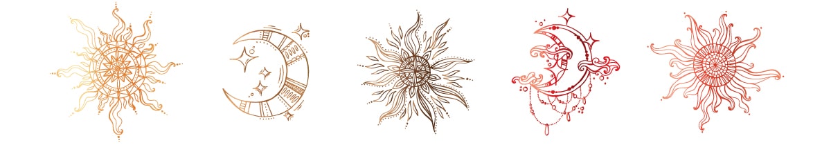
A crescent moon, for instance, is seen as a symbol of intuition, femininity, and the subconscious when it appears on a card. A crown could symbolize authority, power, and success. Think with care about how to make use of these symbols so that the reader can learn more about the card’s meaning.
4. Artistic narrative
Tarot cards are symbolic representations of a broader story. When laid out in a precise order, or “spread,” the cards in a tarot deck can tell a tale or offer advice on a specific issue. Many magical storytellers use them for precisely that purpose: telling stories.
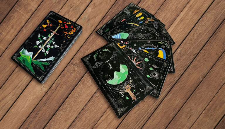
When designing a deck of tarot cards, it’s important to keep the visual style consistent across the deck. The visual storytelling part of tarot card imagery provides depth and consistency to the reading experience through consistent graphic styles, repeating symbols, and thematic aspects.
Creativity and psychology join forces
The aesthetic design of tarot cards is a perfect example of how art and psychology may work together in harmony to generate something that’s as beautiful as it is useful. Tarot cards, with their rich symbolism and detailed artwork, provide a universal visual language. They are works of art that have this extra dimension, to help people connect with their inner wisdom, learn about themselves, and discover the depths of the human psyche.
The significance of careful and proficient tarot card image design is becoming more and more obvious as tarot continues to attract new audiences and adapt to modern sensibilities. As a tarot card artist, you can reach a wide audience and help people find meaning, inspiration, and a deeper connection to life’s mysteries by embracing the basics of symbolism, understanding the evolution of card designs, and mastering the art of composition. You can learn more about the technical side of getting custom tarot cards printed here.
Talk to us!
When you’re ready to print a set of harmoniously composed, high-quality tarot cards— and personal customer service matters to you as much as a world-class product — then we should have a friendly chat. Get in touch today to share your needs or to ask for a no-obligation quote. We can’t wait to help you make the most artful tarot cards you can dream up!


3 thoughts on “A Guide to the Symbolism and Composition of Tarot Card Art and Design”
I want to order the development of my own deck of cards - gold on black
Hi Veronica, thanks for reaching out. We'd love to work with you on developing your own customized card deck with a gold on black design. One of our experts will be in touch soon via email to get the ball rolling. You might also find the following article both helpful and interesting: https://www.qinprinting.com/tarot-card-printing/ Let us know if you need any further help. 🙂
This engaging exploration of the symbolism and composition of tarot cards beautifully combines history, artistry, and advice for aspiring designers. Craftsmanship of the highest order!